Bix7 TShirt Vote:
Pick the better shirt:PICK 2022
PICK 2009
Voted: 0
Bix7 TShirts: A Guide
by John S. Barker, December 2022, Bettendorf, IA
I wanted to share some thoughts on my Bix7 tshirt collection which spans a huge chunk of my life. Someone in my family or myself has run every Bix to date, I grew up around this race, and these shirts. I have most of shirts from those 30+ efforts, but not every shirt that was made. Collecting these is a passion of mine and in the process- thoughts, insights, appreciation, and questions appeared. To me they are an art form and like the Bix7- something I love. Which the shirt designs, there are some amazing mind-blowing designs, and some not so much. These are just my opinions. There is so much rich history through the years. I'm trying to identify the core elements the shirts share, the trends that have come and gone, and the things that set them apart.
In 2014 I learned that my most of my Bix7 shirts vaporized. I was heartbroken.
I have been rebuilding my collection since and the shirts are hard to source.
The more I have sourced and collected the shirts I knew I needed, the more I found variants and related shirts I had no idea existed.
T-shirt designs can't all be winners and like many things fall on a bell curve. Some are works of art, some serve to merely display the what/where/when, and some will get relegated to "meh..." pile.
One of my hobbies is listening to a band's studio discography in chronological order. There is always someone who will declare an artist's absolute worst album the best thing ever made. Like- you can make arguments that it was poorly reviewed, the band hates it, no one bought it- but there will still be that one person who insists that that recording is the finest release that band ever made.
The same is probably true here. If this year is your jam, I understand. It's all subjective.
If you had something to do with one of these shirts, and I have a less than flattering comment- no hard feelings. You are welcome to critique my tshirt designs from the past 30+ years, which do not include a Bix7 T. The early shirts inspired me, they are what I grew up on.
Mad respect for everyone making the Bix7 run possible throughout the years. From John Hudetz mapping the course for the first time, to the creation of Cornbelt Running Club, to my dad and uncle making our family a part of it, to Ed Froehlich making the race other level amazing and successful, to Karl Ungurean, to Michelle Juehring making it all continue to happen, as well as everyone volunteering- I thank you all.
Let's look at The Bix7 Race Shirts!
70s Bix7 TShirts
They don't make 'em like they used to.
1975
I am not aware of a shirt from 1975.
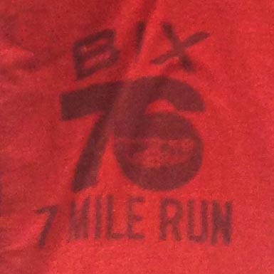
1976
Overall: A
This one started it all!
This is very 70s, very DIY, very basic, very "hey who can silkscreen shirts?" kind of thing. This is period correct in terms of QC design- I checked.
Not many exist. "Hard to find", as the kids would say.
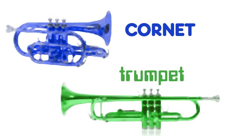
If ever there was a question of "why the cornet?". Bix7 is named after Davenport's own Leon Bix Beiderbecke, the a legendary dixieland jazz musician. He played the cornet.
Don O'Dette spearheaded the Bix Lives jazz festival in 1971 so that was becoming very popular in the area. In 1974 John Hudetz, Brian Owens, and Joe Pena had just done the Boston marathon and thought they should have something of a popular race for their new Cornbelt Running Club.
Hudetz came up with the course. More on that later.
This one is a pretty basic silkscreen job, looks pretty cool with the cornet for the circle on the '6'. I'd like to buy that designer a beer.
We have four (4) original design elements here:
- "Bix" text. This lasts until 1982 when "Bix7" becomes a thing and its one trademark/ word mark
- "7 Mile Run" text. This lasts until 1981 when it's a floating "7" and a year later the "Bix7" tshirt logo is born.
- "76" year text. This format lasts until 1981, where, in full Y2K mode it switches to the 4 number format.
- Cornet image. This appears until 1994 when it was retired.
- Bix Logo MkI
- Cornet
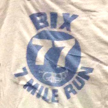
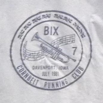
1977 (references 1976)
Along with 76 and 78- a great design all its own.
Here the year text is inverted and stuffed inside the circle. "BIX" text is more stylized, probably a custom font, I feel like it inspires the 1999 Bix7 word mark the way it tapers down.
Here the year text is inverted and stuffed inside the circle. "BIX" text is more stylized, probably a custom font, I feel like it inspires the 1999 Bix7 word mark the way it tapers down.
The "77" pops in the circle. The cornet is placed here because it is important. Now, I'm calling the circle as a thematic element of the Bix7 since it is recurring motif or design element or what have you. There's a circle here. Not a square, or triangle, or other shape. So let's get used to this circle.
This was the first shirt I remember seeing as a kid. We still lived in Davenport at the time, and the idea of a "race" made little sense to my 6 y/o mind. Star Wars, which we just saw in the Milan theaters, was still on my brain.
This design could probably never be reproduced. Too many elements that would have to be shoe-horned in- "July", "Quad City Times", "Davenport, IA"... it just can't be done now.
- Bix Logo MkI
- Cornet
- Circle
- All numbers are 7s!
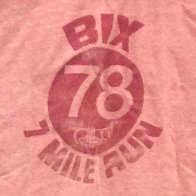
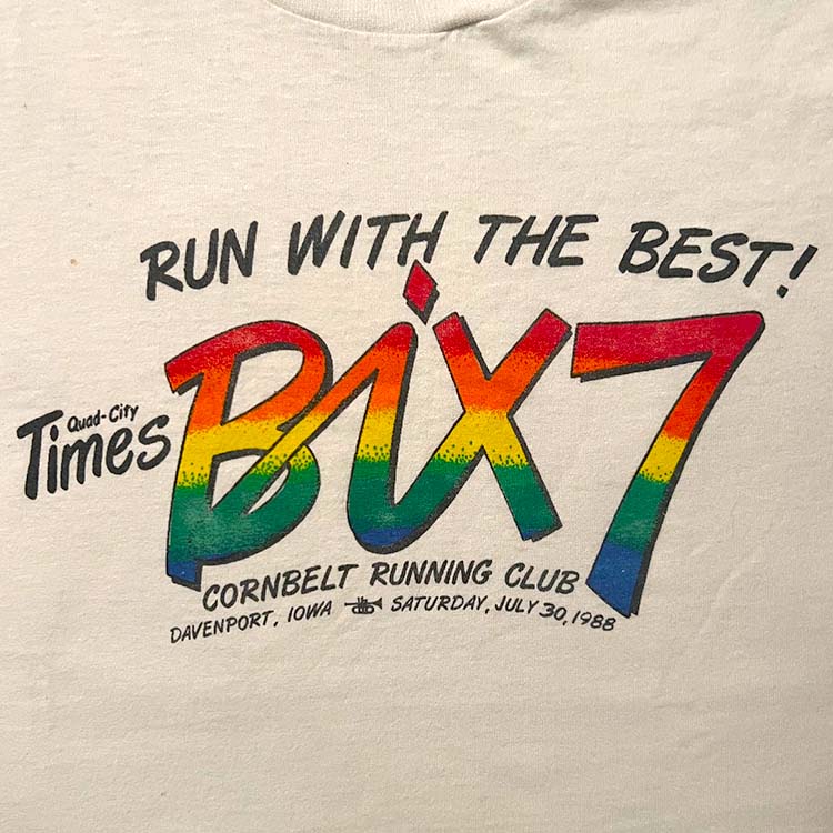
1978
Overall: A
Love the colors of the shirt. Whoever made the choice of these colors- love it. Simple and a ton of personality. It's a "heather red" ringer T. Very 70s.
The "78" text is slimmer than the prior '77. What does that mean, if anything? Not much but hey I gotta make some sort of observation. Red ink on a light red shirt- there's a beauty here in the simplicity.
The 70s was the decade for red Bix7 shirts. This one does not disappoint.
Circa late 70s, The AMJA Running Crew: My uncle Bill Barker, Raj Sekaran, Ed Froelich, Rich Madsen, and the great Karl Ungurean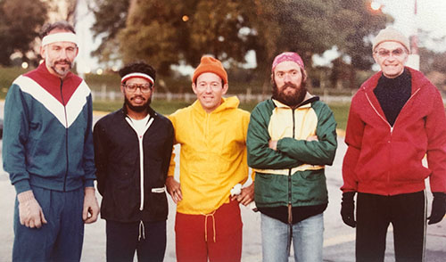
- Bix Logo MkI
- Cornet
- Circle
- Russell heather red ringer tshirt
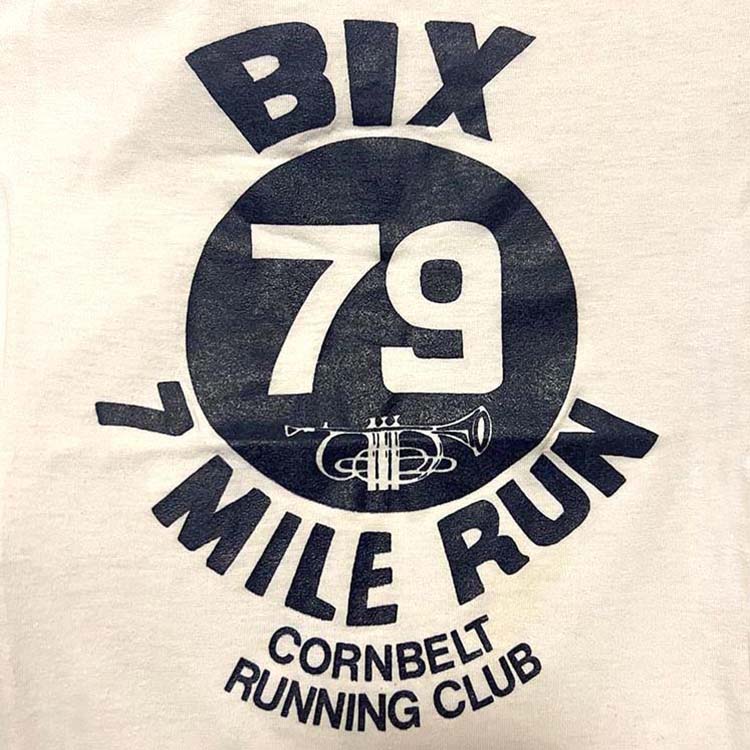
1979 (references 1977)
Overall: A
Love it. BOOM Cornbelt Running Club gets some love.
The Ringer:

Who came up with that '9'? It's like a smooshed "g". As a kid, it always baffled me- "That '9' just does not look right. Needs help".
The 'Cornbelt Running Club' could have just run along the bottom, but I wasn't a part of that design decision. Overall the style maintains that of the previous versions- very clean and simple.
The 'Cornbelt Running Club' could have just run along the bottom, but I wasn't a part of that design decision. Overall the style maintains that of the previous versions- very clean and simple.
Sourcing Bix7 shirts isn't easy. They don't pop up on eBay all too often nor in Salvation Army. I vary up my searches and came across this late 2022 in an online boutique tshirt shop located in the outskirts of Tokyo. How this particular shirt landed there after 40 years I shall never know. It was $150 well spent.
Here we close out the 70s with its relatively simple and pleasing designs as we move into the 80s. What could the 80s and the future hold for the Bix7? A lot.
- Bix Logo MkI
- Cornet
- Circle
- Cornbelt Running Club
80s Bix7 TShirts: 1980-1989
The classic era of Bix7 tshirt design. We have the cirlces, the half circles, and the rainbows.
1980
|
Overall: A
This is the long-sleeve shirt reproduction produced in 2022. I'd love to know the fonts used. You could reproduce the font in Illustrator and re-use that vector pretty easily.
Look at the "I" in the Bix, the 1980 shirt bulges to the right and the 2022 shirt bluges to the left.
The t-shirt color is close to the "Bix7 1980 tshirt" color, but still a bit lighter.
Look at the "I" in the Bix, the 1980 shirt bulges to the right and the 2022 shirt bluges to the left.
The t-shirt color is close to the "Bix7 1980 tshirt" color, but still a bit lighter.
A new decade, a new design. It's a gorgeous shirt. It's got the cornet, the 70s retro font, the circle, some words including "BIX": It's all there! I remember this really well. The Bix7 race back then was still a very small affair and fun way to spend a Saturday with my family.
The thing about this shirt is that it's a tan shirt. It's this particular tan color. It's its own color. The color is "Bix7 1980 tshirt" color, and then that tshirt color was retired.
I can imagine the tshirt design meeting:
"I've been out East and I've seen some real tshirts. I say this year we flip the tshirt design script."
"Like, since we have the date of the race: 1980, also include the location?"
"And the club organizing it?"
"Yeah, and put a circle INSIDE the circle."
"Have the cornet connect with the '8' and the '0'."
"Well, chaps, we've got a whole new script.".
See? Tshirt design evolution in front of our eyes.
The 2022 reproduction is really faithful, and whoever rejiggered the cornet intermingled with the "80" did a great job.
The 2022 reproduction is really faithful, and whoever rejiggered the cornet intermingled with the "80" did a great job.
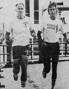
My dad Jack Barker after the 1980 run
- 1976-1980: Bix 7 Mile Run
- 1981-1982: Bix7
- 1983-1984: Times Bix 7
- 1985-2000: Quad-City Times Bix 7
- 2001: Q.C. Times Bix 7
- 2002-2006: Quad-City Times Bix 7
- 2007: ??? Times Bix 7
- 2008-current: Quad-City Times Bix 7
- Davenport, Iowa
- Bix Logo MkI
- Cornet
- Cornbelt Running Club
1981
Overall: A-
This inspired the 2017 design for the 7 Mile Championships T. Except a toy trumpet was used.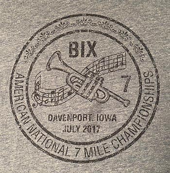
Nice. What I love about this shirt is that whoever did it might have said "Think the'80 shirt was good? We took it up on a whole new level". It's a great addition to the very young history of Bix tshirts. I remember seeing it for the first and thinking "That's cool!". I was still volunteering at the race with my siblings as my dad and uncle ran the race.
It's got the circles, the cornet, Cornbelt Running Club, music notes... and the month of the race, which will come to set a trend in the majority of the subsequent designs.
A helpful guide:
Who knew?

- Musical Notes!
- Month (July)
- Bix Logo MkI
- Cornet
- Cornbelt Running Club
- Circle
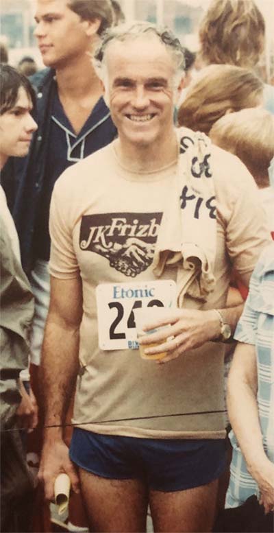
My dad Jack Barker, Ed Froelich in his 2nd year as Race Director, and Tony Gott, former Race Director. That looks to be a light yellow Bix7 1981 shirt.
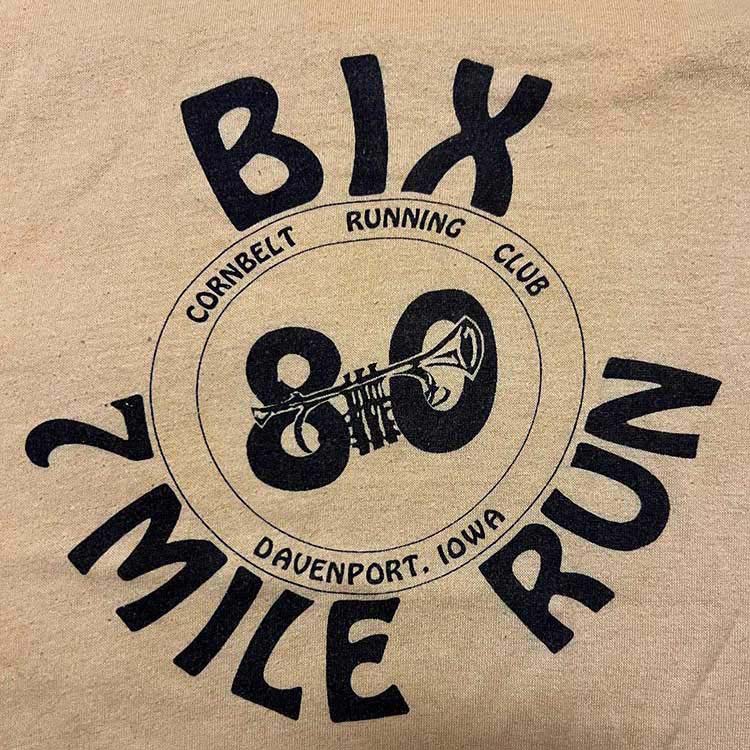
1982 (references 1980, 1981)
Overall: A
This is a refined version of the 1981 shirt, and the first and only Yellow/Orange/Gold shirt ever! It's a classic. Hard to find (like they all are) and just really nice- The cornet [Ed. note: this is a trumpet], the retro font, the circle, and the sheet music in case you need to play along.
While this shirt is quite similar to '81, the type is the same as the 1980 shirt. We also have the first appearance of bunch of runners, which will reappear many times. The "BIX 7" on top replaces the prior "Bix" for the first "Bix7" ever! Woot!
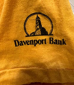
Printing on sleeves? We Got that! This is the only time Davenport Bank was affiliated with the race that I can find.
A memory- this was my first volunteer bix shirt, as I handed out water for the few hundred people running up and down Perry street, near my Grandma's '74 green Valiant. I would see my dad and uncle run by, and proudly try to give them water. My sister ran it, and I probably tried to throw water at her.
Later in 80s I would get that awesome Valiant, and driving to work to Pepe Taco's on night in '87 down Devil's Glen to State Street, and the brakes went. I was able to avoid an accident by swerving into Meineke Mufflers and rolled to a stop.
Later in 80s I would get that awesome Valiant, and driving to work to Pepe Taco's on night in '87 down Devil's Glen to State Street, and the brakes went. I was able to avoid an accident by swerving into Meineke Mufflers and rolled to a stop.
- Buncha Runners
- Davenport Bank branding
- Quad-City Times branding
- Sleeve Printing
- U of Iowa colors (Black & Gold)
- Bix Logo MkI
- Cornet (trumpet)
- Musical Notes!
- Cornbelt Running Club
- Circle
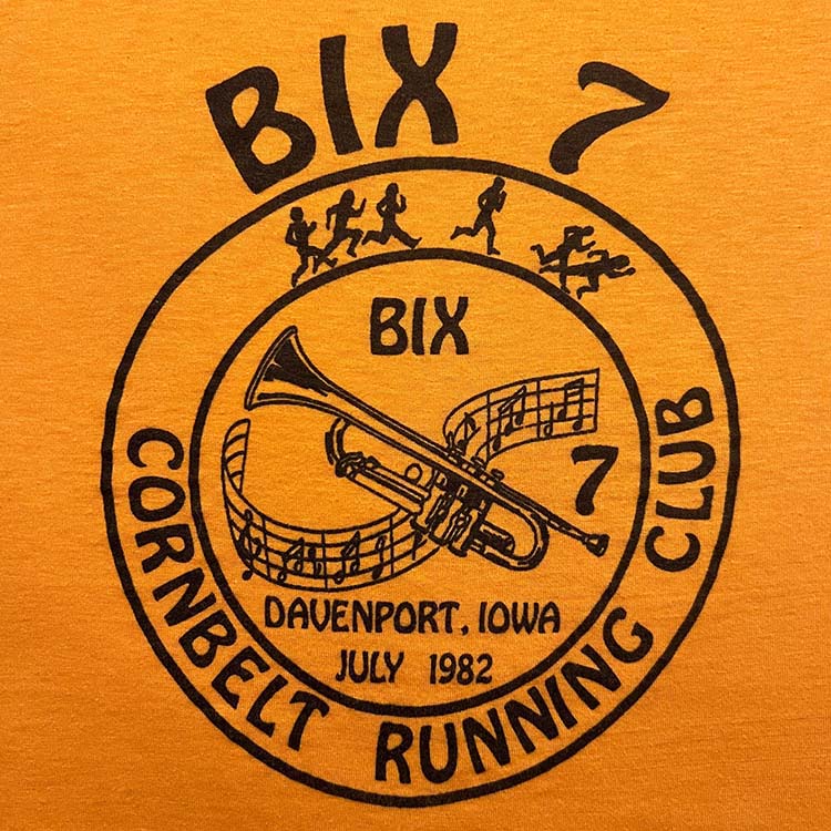
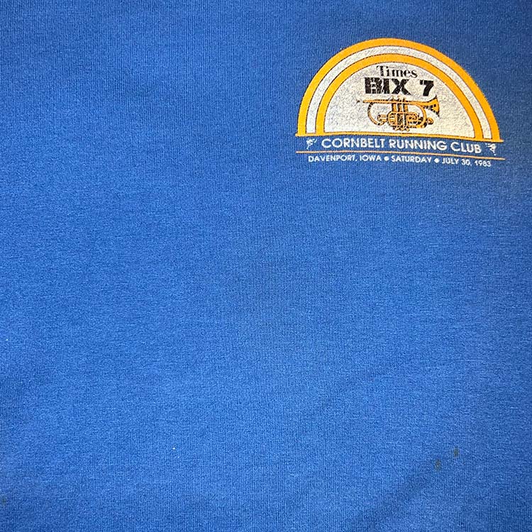
1983
Overall: B
So the 70s rounded out with some pretty raw and very effective designs that would get buried for the rest of the life of the Bix tshirt. 1982? Super awesome. What did 1983 come up with?
The first shirt pocket size design. Who decided to just tear the thing down? That year I was 12 and stationed on a water stop on Kirkwood Blvd. I got the volunteer shirt and thought "that's it?".
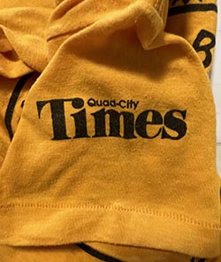
Also of note this is the only other occurrence of "Times" (also 1984) vs "Quad City Times". This must have driven the QC Times managers crazy. "Times like these", I pondered. This is the first time the precise date of the race is included (salient point that changes everything? You decide).
Thankfully the day of the week, Saturday, was included.
Thankfully the day of the week, Saturday, was included.
I was also kind of worried that this being the 2nd year of small designs is that was this the end of cool designs? After the AWESOME 1981 and 1982? And everything from the 70s? We're humble here and, it's not like someone who did the poster from the Fillmore or Col Ballroom was going to make this incredible work of art that is captured on a tshirt that would never ever be forgotten since.
- Shirt pocket design
- Blue shirt
- U of Michigan colors (Blue & Gold)
- Runner clip art
- Blue tshirt
- Race Date
- Race Day of the Week
- Cornet
- Rainbow-ish
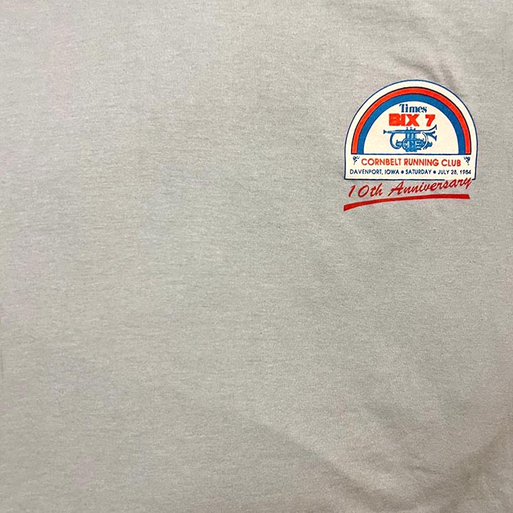
1984 (references 1983)
Overall: C+
And the volunteer version:
"Volunteer" tshirt versions appeared around this time because as the race grew- the need for organized race helpers grew. I was volunteering with my family around this time and the cool this was- you got a free Bix7 tshirt! However, it was colored different, so you could tell who was helping out.
"Volunteer" tshirt versions appeared around this time because as the race grew- the need for organized race helpers grew. I was volunteering with my family around this time and the cool this was- you got a free Bix7 tshirt! However, it was colored different, so you could tell who was helping out.
The 1983 design recycled. It worked for the 70s shirts, but this wasn't worthy of a victory lap here.
Nifty pocket design:
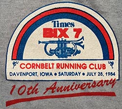
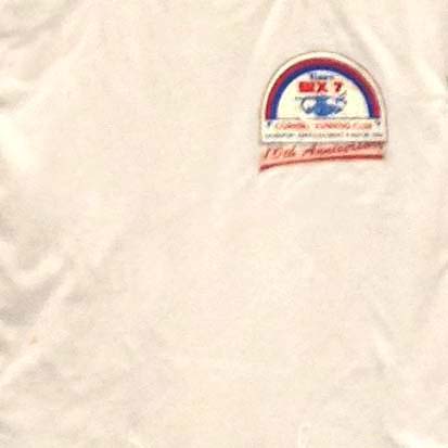
Here we have the precursor to the rainbow colors with... a rainbow shape. It's kind of a circle motif... just cut in half.A nitpick, other than the shirt pocket design, is that we get a script font splashed across it with "10th Anniversary". Not getting too crazy, maybe back in 1984 it was like "script font splash with underline"- people will get it.
It's the 10th Anniversary- this is awesome
When the race was a few hundred people and you could park your car along the race route:
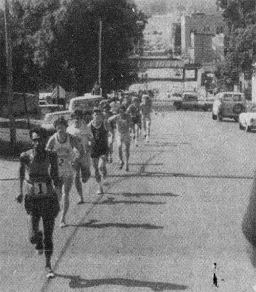
My dad and John Hudetz in 1975
This shirt is not so good. It was probably just an attempt at a shirt that seemed safe. But, the stark design element dwarfed by the large solid gray shirt is depressing, taking into account all the ones before it.
- Cornet
- Runner clip art
- 10th Anniversary!
- Race date
- Race Day of the Week
- Rainbow-ish
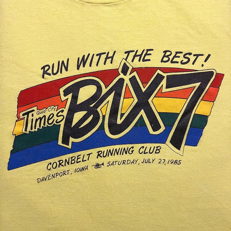
1985 (copied by 1986, 1987, 2019, referenced by 1988)
This is the yellow volunteer version.
That year I again manned a water station on Brady, having chickened out running this one. Later we went down to help with the tabulation of the runners in some building along 2nd.
1985, 86, and 87 shirts are scarce.
That year I again manned a water station on Brady, having chickened out running this one. Later we went down to help with the tabulation of the runners in some building along 2nd.
1985, 86, and 87 shirts are scarce.
Overall: A
Classic. The most repeated Bix tshirt design.That's prime ’80s beef right there.
Lke all 80s Bix7 tshirt, this is hard to find.
The next era of great Bix7 designs, including:
• New logo, the Mark2 logo, still in use over 35 years later
• Rainbow wave
• "Run with the Best" slogan
• mini-cornet icon
I mean what more do you need?
• New logo, the Mark2 logo, still in use over 35 years later
• Rainbow wave
• "Run with the Best" slogan
• mini-cornet icon
I mean what more do you need?
I remember thinking clear as day "this shirt is so good, it's got a least two more years in it". Overall it just makes me smile. No gimmicks. All heart and love. So here introduced is the Mark2 Bix7 Logo and the first appearance of "Run With The Best". The Bix7 race was getting national exposure and was becoming a draw.
I'd love to know who was responsible for this design. "Quad-City Times" and "Bix7" are designed by hand, obviously. The rest of the text is a nice script font. From that time I wonder how it was done, on a curve like that.
- Bix Logo MkII
- Rainbow
- "Run With the Best"
- Hand drawn QCT Logo
- Cornet
- Race Day of the Week
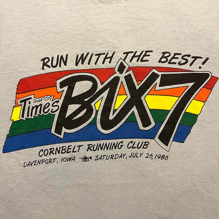
1986 (copies 1985)
The grey volunteer version.Classic. See above.
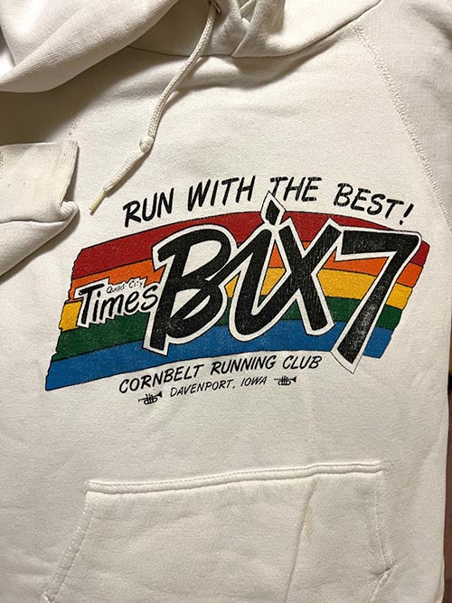
Nice hoodie from that era
- Bix Logo MkII
- "Run With the Best"
- Rainbow
- Cornet
- Hand drawn QCT Logo
- Race Day of the Week
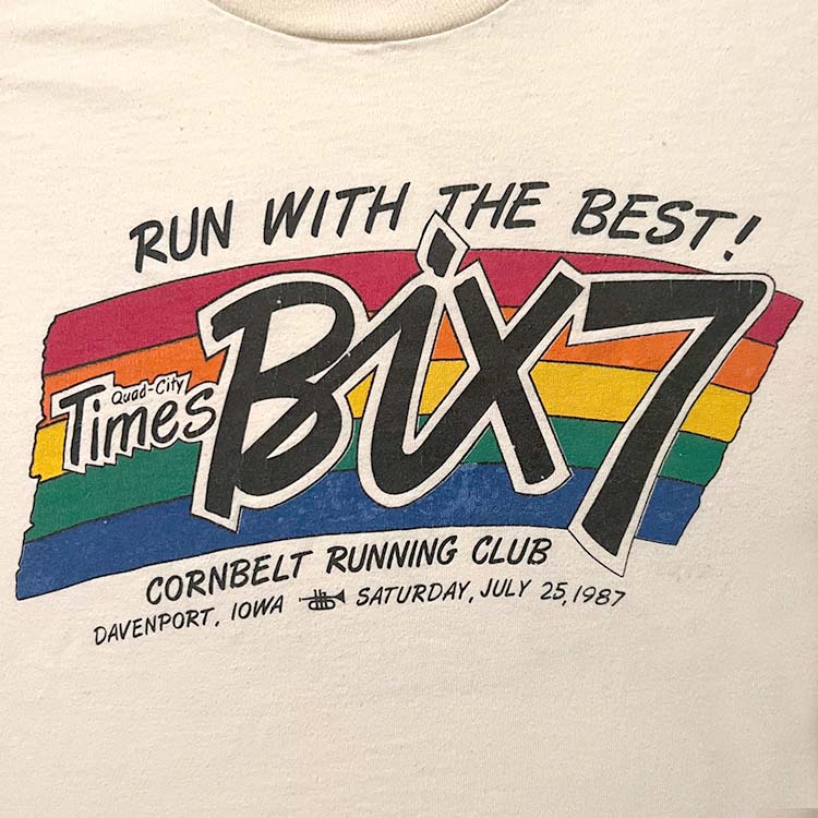
1987 (copies 1985)
Overall: A
This was the first Bix race I ran. Took me 1:11.
Classic. See above.
Fixed:

My only nitpick of this series of shirts is the paint lines on the left not looking like they were drawn in a clean stroke. As in the left border was drawn first and the colors were filled in.
Here's a fix, but it kinda loses that charm
Here's a fix, but it kinda loses that charm
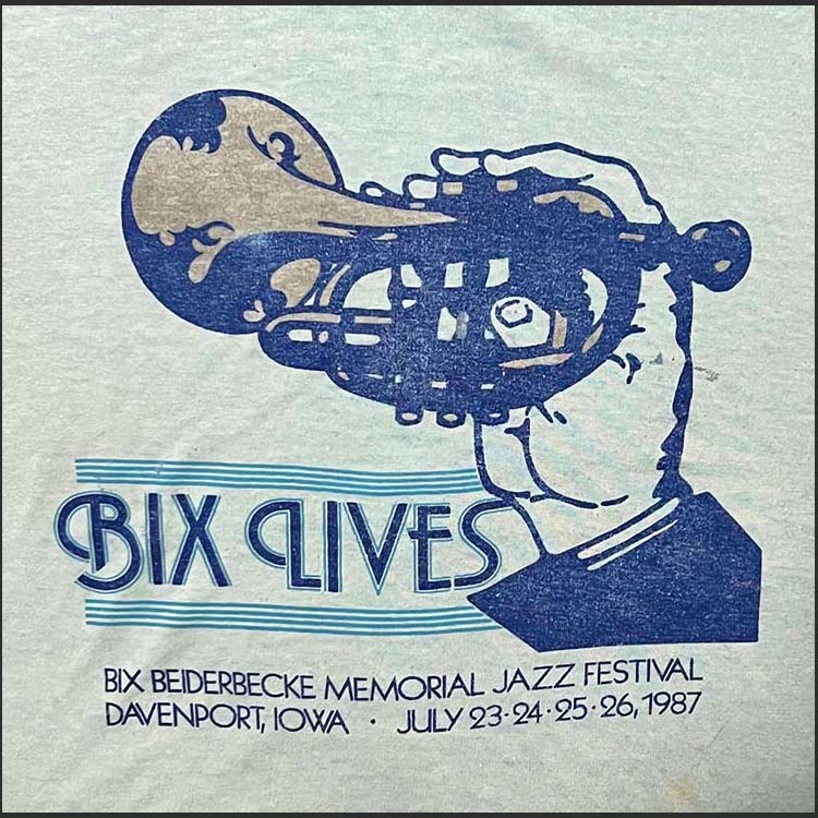
This well worn jazz fest shirt:
This isn't unprecedented- the 1976-79 shirts were basically the same. I am biased since I love this particular design. The 2019's take on this was well intentioned, and proof that this design made an impact. Like, real scientific proof, made by scientists.
- Bix Logo MkII
- "Run With the Best"
- Rainbow
- Cornet
- Hand drawn QCT Logo
- Race Day of the Week
1988 (references 1985)
I remember where I was on Saturday July 30th, 1988. Overall: A
This is my all-time favorite. It's a refinement of the prior three (3) years of designs and it's all around just very satisfying to look at.
The color spectrum that was behind the text is now inside the text. Boom. I want to find the person who made this design decision, thank them, and make a documentary or miniseries about this. Here we also see something that would get lost in the next few decades: The loss of Bix7 as the dominant element, removal of the cornet, "Run with the best!" getting replaced with less inspired phrases, and on and on.
As the shirts in the 70s showed us, and now the 1985-1988 shirts showed us: how long can a theme get repeated before it's worn out its welcome? (answer: 2). There are certain elements you want to include, themes, what not. Let me ask- if the Bix7 had it's Coke branding moment- what would it be? So that a Bix7 logo would be completely recognizable in anywhere you saw it? There have been so many takes over the years but the 2 essential branding elements are there. We'll get to those later.
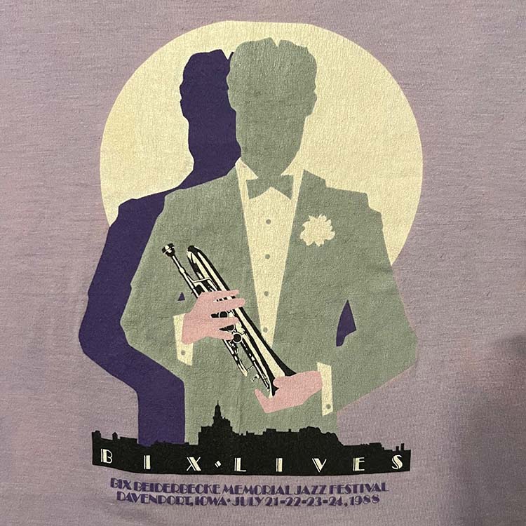
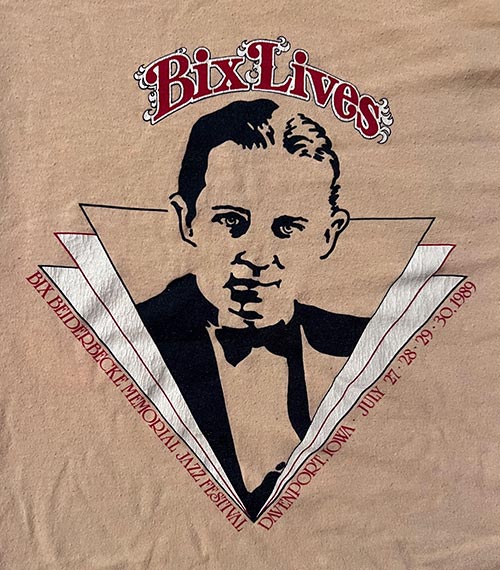
This fancy 1988 Bix Lives shirt:
This is the last Bix T with both Cornbelt Running Club and QC Times. Both fonts look to be nicely done hand-drawn fonts.
Here's what "Run with the best" means for me: It was pretty much the only race I knew growing up. My dad and my uncle ran the first one back in '75. Running the Bix was running with the best- the family members I loved, the friends I knew who wanted to run it too, running the route and seeing people you know cheering you on. And the satisfaction of running down Brady and 2nd St to the finish.
Every single 30+ years of running the Bix I ran with my sister. Each time we figured out the logistics getting to the race, parking the car, putting our bibs on, getting to the race start, meeting at the post-race party and going directly to Whiteys (where I worked in HS) on Locust to grab a shake. Every time from the 80s to now.
Every single 30+ years of running the Bix I ran with my sister. Each time we figured out the logistics getting to the race, parking the car, putting our bibs on, getting to the race start, meeting at the post-race party and going directly to Whiteys (where I worked in HS) on Locust to grab a shake. Every time from the 80s to now.
- Bix Logo MkII
- "Run With the Best"
- Rainbow
- Cornet
- Race Day of the Week
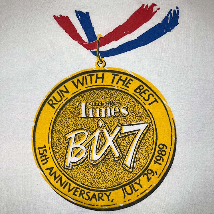
1989
Screen Stars Best 50/50 blend. sporty lightweight shirt that ages nicely
Overall: D
The Medal IS the shirt.
Originally I thought it looked silly. After all the great shirts over the past years- this is what they came up with? 15th Anniversary there is a medal on every shirt. Tshirts with medals-as-design? Mmm-kay.
Nice 1989 Bix Lives shirt:
WHO made the call to make the '89 shirt a medal? Why? I need answers. Well- forget that. I begrudgingly like it and it's one of a kind. It's happy. It's fine. It's the 15th Anniversary.
Oddly, "Davenport" and "Cornbelt Running Club" are missing. Actually, "Cornbelt Running Club" will never appear on a race shirt again.
A fun shirt by legendary artist John Holladay:
Oddly, "Davenport" and "Cornbelt Running Club" are missing. Actually, "Cornbelt Running Club" will never appear on a race shirt again.
I still see this shirt at Bix runs to this day, so ultimately: respect- someone has a sense of humor.
Wait, no- this one sucks.
- Bix Logo MkII
- "Run With the Best"
- Circle motif
- Comes with its own Medal
- Anniversary Shirt
- Davenport
- Cornbelt Running Club
90s Bix7 TShirts: 1990-1999
A lot of color and style. Arguably the top decade of Bix tshirts. A couple fails but this decade is hard to top.
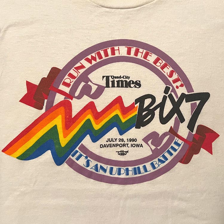

1990
Overall: A
The volunteer version: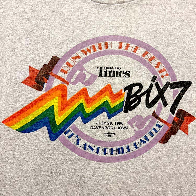
This super-awesome light blue version: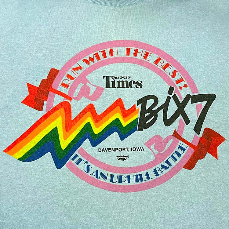
Love the colors used here. Here we have a completely new design with some familiar elements! The Bix7 Mk 2 script logo introduced in 1985, A take on the rainbow ribbon. "Run With the Best" in that funky art deco font. The colors! Love the lavender (plum?) circle and the reddish ribbon. The circle is back. The cornet.
It's a nice mix of these elements without a really dominant element, but still very Bix-y. This wasn't thrown it together in a couple hours. There was some top notch work and care put into this.
The rainbow is continuing to be a established branding element. And used for the first time time- the Top Hat art deco font. The shirt also states "It's an Uphill Battle", which, if anyone has ever run the Bix- this is a completely truthful statement. The downright mean hills and slow burns make the downhill parts seem like an outright lie.
- Three shirt colors
- Bix Logo MkII
- "Run With the Best"
- Rainbow
- Circle
- Cornet
1991
Overall: B+
A well worn volunteers version:
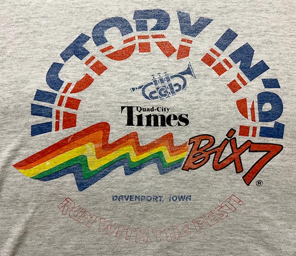
This one I like- it's basically a repeat of 1990, which is rocking the cool rainbow trail and the MarkII Bix logo. The shadow on the Bix7 is a little flawed, but otherwise fine. The type treatments are pretty cool, I dig the outline of "Run with the best", that's something not done too often. QCT is front and center, and so is the Cornet!
"Victory in '91" was in response to the end of the Gulf War, which isn't the first time the Bix7 shirt will echo the politics of the day.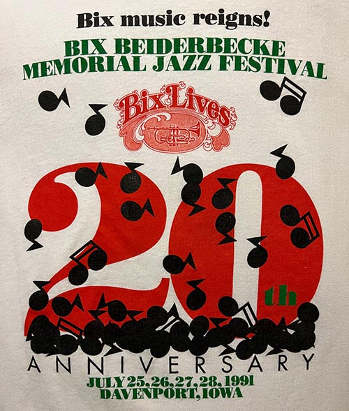 Also this is the first shirt to list the year of race more than once. This is only notable since shirts in the aughts would list the year multiple times, with 2006 tipping the scale at 4 times.
The '91 Bix Jazz Fest tshirt: A truly amazing design
- Bix Logo MkII
- "Run With the Best"
- Rainbow
- Circle
- Cornet
- 1991 mentions: 2 times
- First Year Repeated
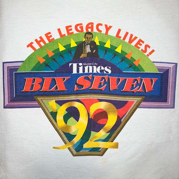
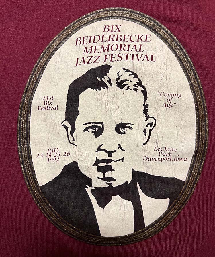
1992
Overall: A, Top 5
The First Bix7 with Bix Beiderbecke. Mad props.
This one is very hard to find, but any shirt older than 30 years is.
The First iconic "Running Man" artwork. that will next appear again in much more spectacular fashion in 1994.
The First Bix7 tshirt designed all digitally, I'm guessing. Thankfully it's not overdone as to be a "HEY I HAVE A MAC QUADRA 700 COMPUTER AND LOOK WHAT I CAN DO" kind of over indulgent computer style from that era. I was in college at that time and had a summer job at Fuller printing where I used PageMaker to replicate analog designs "Down to 1/256th of inch, if I have to". So long ago, but even with a 25MHz machine: great tshirt designs are possible.
The First Bix7 tshirt designed all digitally, I'm guessing. Thankfully it's not overdone as to be a "HEY I HAVE A MAC QUADRA 700 COMPUTER AND LOOK WHAT I CAN DO" kind of over indulgent computer style from that era. I was in college at that time and had a summer job at Fuller printing where I used PageMaker to replicate analog designs "Down to 1/256th of inch, if I have to". So long ago, but even with a 25MHz machine: great tshirt designs are possible.
The first of three designs to use "Bix Seven" and not "Bix7". The Bix7 branding was an evolution, to be sure.
There's nothing like this one. '92, '93' and '94 are in a category by themselves. This one is tops.
There's nothing like this one. '92, '93' and '94 are in a category by themselves. This one is tops.
You have the purple rectangle in the back doing it's thing. The green arc with the yellow and orange triangles doing their thing. Bix is chilling with his cornet, also doing their thing. '92 is BIG and hanging out below the line, blending in and doing its thing.
The '92 Bix Jazz Fest tshirt: "must love maroon"
My only knock on this is the Bix Seven treatment (red, with white edges and black dropped shadow) Should have been a sans-serif font and maybe have been a little better? A nitpick from a non-designer.
I love this one and you don't see it around much. "The legacy lives? More like 'the lunacy', amirite?!". I kid, I kid. I turned 21 that year and had my best Bix time at around 54min.
- First Running Man
- "BIX SEVEN"
- Custom Logo
- Bix Beiderbecke!
- Cornet
- Davenport
- Race date
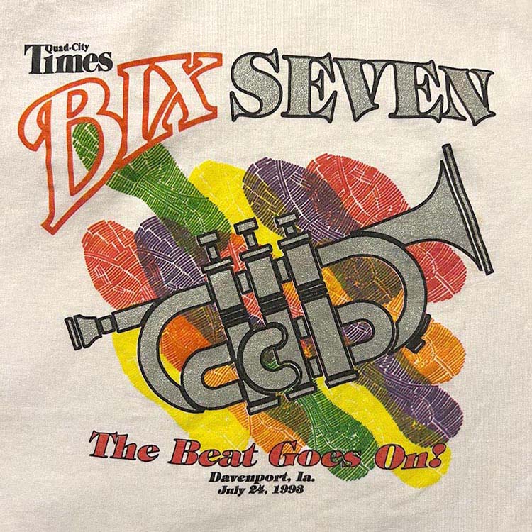
1993
Overall: A
This volunteers version:
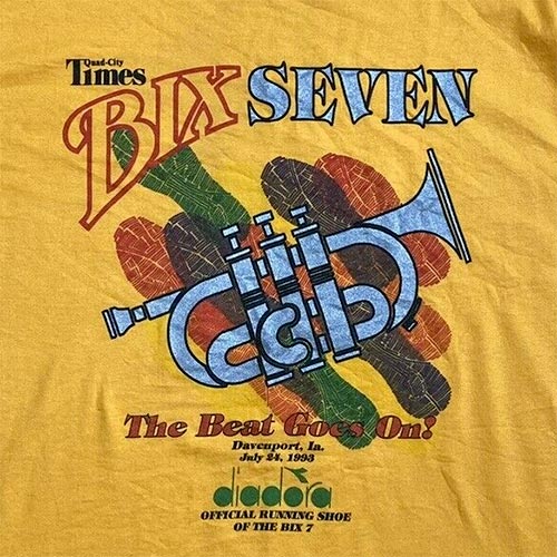
Continuing the run of amazing and colorful 90s Bix7 is 1993. Love the color treatment here on the shoe treads.
This is a great shirt. The cornet design element is the hero here and will never be featured on an official Bix7 shirt again. Why? Don't know.
The "Bix Seven" type runs the width of the design, which will never happen again[Ed. note: Check 2008- it's close]. I mean will NEVER EVER happen again ever.[Ed. note: Check 2016]. I mean not with the number 7 spelled out as "seven".[Ed. note: okay].
What's interesting about the "Bix" logo typeface treatment, that it's the same as the Avati film biopic "Bix" logo from 1991. Not gonna take my word for it? Just look at the pictures below! Go ahead!
It uses a skewed serif font and it's pretty slick. It's as close to the 'Bix Lives' logo as a Bix7 logo will get. This logo gets used the next year and will never be heard from again.
It uses a skewed serif font and it's pretty slick. It's as close to the 'Bix Lives' logo as a Bix7 logo will get. This logo gets used the next year and will never be heard from again.
- Cornet
- Rainbow motif
- "BIX SEVEN"
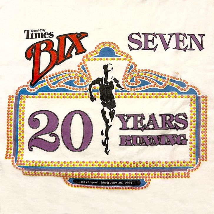
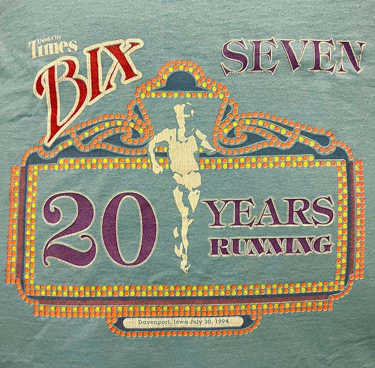
1994
Overall: A
The great looking robins egg blue version. Possibly the volunteers version? This is absolutely gorgeous. Love it.
If anyone has one of these, count yourself very fortunate.
If anyone has one of these, count yourself very fortunate.
And THIS dark grey version, I'm not sure about the significance but it's darn cool. It was a complete fluke that I found it, so I am darn lucky.
And THIS dark green long sleeve version. As the saying goes- you look long and hard enough- you will find all the versions of the 1994 Bix7 tshirt.

The Marquee Bix Shirt! Ending the run of amazing and colorful 90s Bix7 designs. Here we have the Running Man icon front and center. The design evolves. I love the splash of color the marquee lights design provides.
A design so good, they had to make it in four (4) colors
Four versions?! Cool!
Twice over the years on our Bix7 ritual my sister and I coincidentally wore this very shirt. It must be important.
Interesting to note is that this is the first Bix7 race shirt that doesn't have Bix Beiderbecke's instrument of choice- the cornet. 1993 was the swan song for the appearance of cornet, effectively putting it bed. Why? Well let's look at the origin of the Bix7 race in 1975: The Bix Lives Jazz Festival was established in 1971 and was the marquee event. The race started in 1975 and was comparatively very small in comparison to the growing jazz festival. Here we are in '94, and the Bix7 race was it's own thing- it didn't need to piggyback on the Jazz Festival. The awesome Running Man icon replaces the Cornet icon.
The last great Bix design of the original era
After this there are a few standouts, but a consistent focus on great design got lost.
- Four shirt colors
- Running Man
- "BIX SEVEN"
- Marquee
- Anniversary Shirt
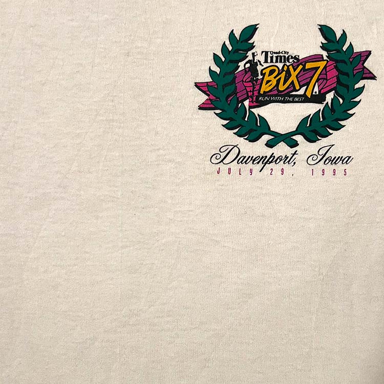
1995
Overall: D+
So much negative space design-wise.
Took me years to track this one down. The problem is I found it.
No. Even tiny running man can't save this one.
Simple in its design and implementation, the 1995 has a classic feel with the core elements and a nice color palate. Bix runner behind some fronds with the Bix letters in classic script. The purple banner is nice, I'll give it that.
"Why not make it look like a golf shirt? With 'Davenport, Iowa' in a fancy font?"
... Ehh.

At the time I thought "this is it?". You don't see this one around much if at all.
- Running Man
- "Run With the Best"
- Bix Logo MkII
- Shirt pocket size
- Laurel fronds
- Davenport in a script font
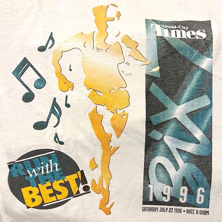
1996
Fruit of the Loom Best cotton blend. Print quality fades heavily over time.
Overall: B
The grey volunteer version. MidAmerican Energy is printed on the back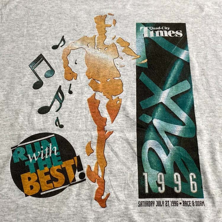
Not a bad shirt. It's to the point, with a transformed logo, but it's definitely a Bix shirt.
This is a completely new design. Like a design firm was hired to come up with some designs and branding including the vertical Bix banner with the neon lines in the back. However the year is at the bottom steps on the Bix7 text. Either someone didn't notice or particularly really care. Quite possibly *I* a missing the point and this is "art" being art.
Running man is here full force!
Love it! Have to call attention to the "Run with the Best"- it's awesome that that text is there, AND it's in some mid-90s badge that you'd expect a professional agency to come up with.
Where the shirt fails, and fails big time, is that it has the race start time. This is the ONLY Bix7 shirt that features the start time- instantly making this one of the most sought after Bix7 tshirts in existence.
Somehow the race time was picked over the inclusion of Davenport or Iowa. Where the heck is this race? You'd never know. I will forever wonder why. When I'm wearing a Bix7 tshirt in another state- I want people to notice that it's not only a race shirt, but that it's in DAVENPORT, IA- the town I grew up in. "Davenport" is also a cool sounding town- a good branding element in my opinion.
Possibly a race consultant advised "Well if we *put* Davenport on it, people will think they can only run it if they're *from* Davenport. The fact that the race is IN Davenport is rather incidental".
We lost Cornbelt Running Club, the Cornet, and now Davenport. Clearly the logo makes up all of that.
Clearly turned the whole thing on its side.
- 8:00AM Race Start Time
- Bix Logo MkII
- Running Man
- "Run With the Best"
- 1996 mentions: 2 times
- Race Day of the Week
- Davenport
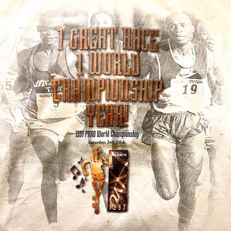
1997 (references 1996)
Fruit of the Loom Best cotton blend. pretty good shirt.
Printing quality isn't the best and fades over time.
Printing quality isn't the best and fades over time.
Overall: C-
It's not bad to look at, but what is it?You can't really tell it's a Bix T. Bix is tiny and at a 90° angle and the 'B' is stepped on by the "1997". It includes a mini-version of the '96 shirt. Bad idea.
The Running man is there. We've got some musical notes slapped next to him like he's pootin' notes, because music- specifically Dixieland jazz as pioneered by the legend and Davenport native Leon Bix Beiderbecke.
It feels like it was rushed by someone who didn't know what the Bix is and was told "Use this photo, with this text and put the text "Bix" somewhere. With Quark XPress or Pagemaker on a 100MHz machine it might take an extra hour to crank this out. Basically scale down the design from the prior year, add an image background (still 300dpi!) with opacity, and add some type treatments to some text. And don't put 'Davenport, IA' on it.
The Bix7 Pro World Championship tshirt. The skewed pill shape is very 90s. Have no other information about who produced this shirt.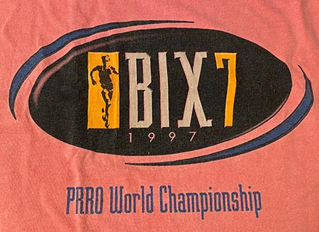 Running man on the poster has better detail
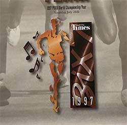
Running man on the poster has better detailRace folks probably got the design shipped to them on a Zip disk the day of the deadline and were like "You forgot Davenport".
- Photo-real image
- Running Man
- Bix Logo MkII
- Davenport
1998
Fruit of the Loom Best cotton blend. Pretty good. Printing fades.
Overall: D
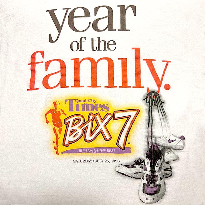
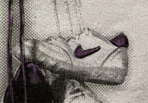
It's no secret that this year was the Year of the Family. Nothing else to see. Oh, it's also a Bix7 tshirt. The Bix design team has taken the shirt back after two (2) years of someone else doing it and the message is: "Year of the Family".
Laces can't be made to look like they are hanging on the 'Y':
Sweet Nike kicks!
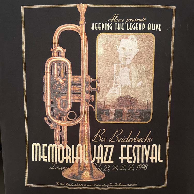
The Bix Lives Jazz Fest T
Sweet cornet! Good ol' Alcoa.
If you try to read into the text- a sans-serif Times font is used, lower case, not capitalized. The type treatment has to mean something, right?
What's to love is the yellow blob with the Bix Mark II logo, the running man (orange), purple QC Times and the white on purple "Run with the Best" (which scores major points). And these are fall colors, so the brown & yellow scheme is wrong- if it's the wrong color scheme I will just KNOW.[Ed. note: Oh shut up about the seasonal color choices as you proffered no PANTONE color palette]
This shirt is a weird one and I rarely see it. Consider this one of the worst Bix7 shirts. Those who came for Family in 1999 were a year too late.
- Bix Logo MkII
- Running Man
- "Run With the Best"
- Nike Logo
- Davenport
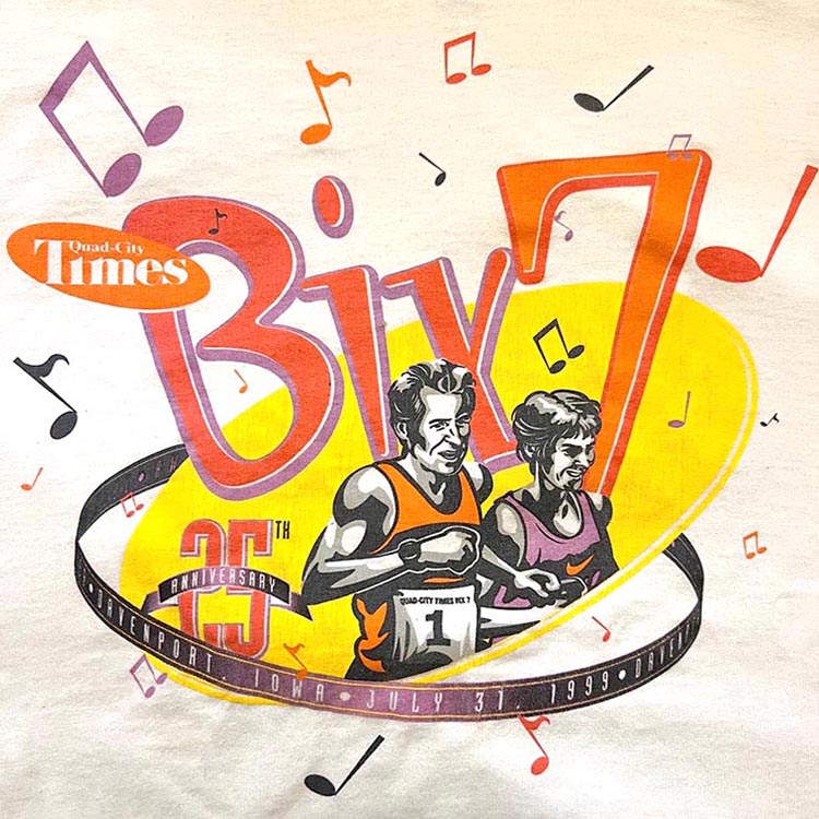
1999
Fruit of the Loom Best cotton blend. Heavy fabric.
Wore the heck out of mine so this one shows a lot of age.
Wore the heck out of mine so this one shows a lot of age.
Overall: A
This one is great. Full stop. It's says BIX!! in a very cool way. The design is new and really works. We've got Bill "Bix7 Billy" Rodgers and Joan Benoit Samuelson. The notes look cool. It's got heart. The band has all the info you need to know and it's really well done!
A lot of love went into this and it shows. Illustrations don't happen often on a Bix7 shirt and the photo likeness is done really well.
This is the only shirt to mention Quad-City Times Bix 7 twice, a fact which probably isn't significant but worth mentioning.
I feel like the colors- the orange, orangered, yellow, and violet were a bit risky (this wasn't an "easy" color palatte- a lot of thought went into this), and it works. The variance of color on the Bix and the 7 are different with their own shadow color. Unlike 1998 this doesn't say "Fall colors".
A great way to close out the 90s.
- Bill Rodgers
- Joan Benoit Samuelson
- Custom Bx7 wordmark
- Runner illustration
- Unique Bix Logo
- Anniversary Shirt
2000s Bix7 TShirts: 2000-2009
The Dark Ages: Tall Years and Bad Rhymes. Why did this have to happen?


2000
Gildan Ultra Blend Heavyweight. sporty lightweight shirt
Overall: A-
New century, new shirt design! This one is actually pretty slick. The Bix logo dominates, colors are balanced, and a great text treatment. Very crisp, it's its own design. "The first Bix7 tshirt of the Century!".
This shirt has a high show off quality. Nice red texture flare on the right, nice type treatment with a 3D effect. Absent are any elements used prior. Ever! Look it up! No "Run with the Best", running man, rainbow banner, cornet, etc. I wore this under a jacket while visiting a Walgreens off Kimberly in Fall '22 and someone commented "Nice Bix Shirt", so this one is verified recognizable. We were very concerned about that.
One quirk is the "i" in the Bix7 word mark. It's got the serif at the top making it look like the number 1. It looks cool, and it draws your eye (not a pun, nor worthy of pun treatment). It really makes the logo stand out in a memorable way. No one since has done it.
Could this quality set the tone for what we can expect from Bix7 shirts in the aughts?[Ed. note: No, it won't].
- New Logo Mark IV
- First Bix Shirt of the Century
- Month and Day of race
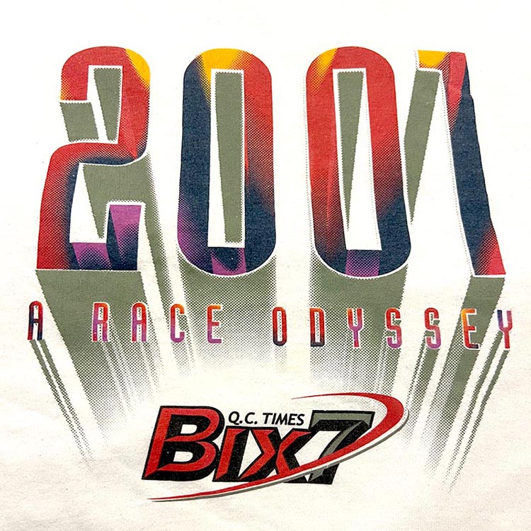
2001
Fruit of the Loom Best cotton blend. pretty good.
Overall: C
Nice colors, imho, actually. And- it's 2001. '2001: A Space Odyssey' was a movie. 'Race' rhymes with 'Space'. I'm trying to crack this mystery.
I feel like I have the wrong shirt here or the person who did this had no idea what they were doing. Now the shirt is a gimmick. The year is the hero here and there's no date, no Davenport, IA and a bad gradient fade.. Details, details...
Okay, it's 2001, I can tell by the tall year text. One and done- promise me you won't do that again, cool?
Someone thought "2001: A Race Odyssey" was so damn epic that nothing else matters. Davenport does, my fellow earthling. I think Keir Dullea ran this one too. "Q.C. Times" isn't even on-brand with a sans serif font. But it looks slick- so points for rebranding the Quad-City Times (the sheer audacity...). Bix7 with the swoosh does look cool- someone put some time into that.
A new theme emerges here that will dominate the decade- the shirt is now about the year. So the year must be big.
- Tall Year
- Pun
- Davenport
- Month and Day of race
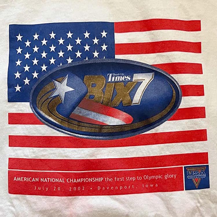
2002
Fruit of the Loom "Lofteez". 100% cotton. Heavy shirt.
Overall: C
I don't remember anything about the American National Championship that year. My mind was on a lot of different things.
This is the first really patriotic themed shirt and not the last. It's fine, it's nice. The Bix logo is a bit crowded out but we do have that star with its golden trail. Other than the US Flag not a lot of new stuff here, design wise. I feel like it's a little too red on the bottom- the flag stripes are done but there's the repeat at the bottom wit the text. I feel like if that was a different color it might bring more attention to the Championship thing. "first steps to Olympic glory" is very downplayed. Very humble.
This nice shirt from the Bix Lives Jazz Festival. Looks like it's from the 70s:
I got this shirt a couple years ago on eBay. It was in storage for some time, and this summer I washed most of them. Well, the color red ran on this one and stained a bunch of my other shirts including this one. Sigh...
- American Flag
- American National Championship
2003
Anvil 100% cotton T- way too heavy. Printing does not age well.
Overall: B-
Tall. Year. Text. Again.
Get used to it. Not much originality here. And someone said "Zap 'em with music notes- this Bix guy knew music, right?" Okay please tell me why is the year of the race more dominant than the Bix7 logo? What the heck is going on here? A stylistic choice, I'm sure. Bix7 styling in the oval is pretty great- why not make that the hero design element?The poster (note the cornet):
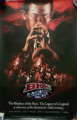 Initially I wasn't sure what this shirt was about.[Ed. Yeah, because everyone knows]The notes on a Bix shirt are nice, actually. Something musical. "The rhythm of the race. The legacy of a legend". That helps and is backed up by the poster.
Initially I wasn't sure what this shirt was about.[Ed. Yeah, because everyone knows]The notes on a Bix shirt are nice, actually. Something musical. "The rhythm of the race. The legacy of a legend". That helps and is backed up by the poster.Seems every year when I get a poster at the race packet pickup, it somehow disappears despite efforts to preserve them. Like, every year. Note to self- try harder next year.
The Bix Logo element in the oval with the music notes is actually pretty good. Why not make that the hero element of the shirt? Why make 2003 the dominant element here?
Which legacy? Bix!
Which legend? Bix Beiderbecke!
It's good. Best of the "tall year" series.
Which legend? Bix Beiderbecke!
It's good. Best of the "tall year" series.
- Tall Year
- Tiny QC Times
- 2003 mentions: 2 times
- New Mark V Logo!
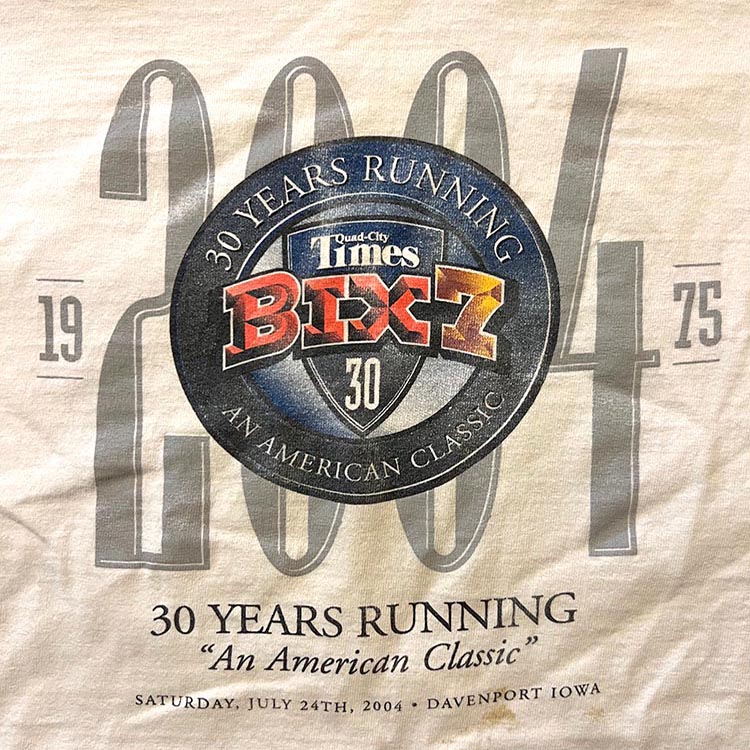
2004
Anvil 100% cotton T- way too heavy. Printing does not age well. The stain on this one won't go away. I wore the heck out of this one.
Overall: B-
Hey- it's 2003 reheated! Going back to the well, it's the tall letters treatment. No harm, no foul- no one got hurt here. This is probably the best of the "Tall Year" Bix7 shirts.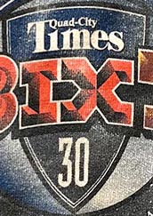 What this shirt does have is the first appearance of The Badge! branding element. The Badge pairs with the MkIII Bix7 Logo across it, can fit the QCTimes branding (legible!) and something at the bottom (like a number). Either this was the product of some high powered branding or design agency or a happy accident. It one ups the Oval design.
The design encased in the circle is pretty nice. It should be the hero element and it doesn't need the tall year behind it.
Lacks some of the charm of the 2003 shirt. For some reason some shirts of this era don't wear well. Like, wear the heck out of it and the printing fades. That happens with tshirts and life, you might think. This is true. Probably 500 years from now this will not be an issue for anyone- the 2004 Bix7 tshirt.
THE BADGE
What this shirt does have is the first appearance of The Badge! branding element. The Badge pairs with the MkIII Bix7 Logo across it, can fit the QCTimes branding (legible!) and something at the bottom (like a number). Either this was the product of some high powered branding or design agency or a happy accident. It one ups the Oval design.The design encased in the circle is pretty nice. It should be the hero element and it doesn't need the tall year behind it.
In the circle we have "30 Years Running. An American Classic".
Okay, looks nice, serif type treatment is fine. What do we have underneath the shirt? "30 Years Running. "An American Classic"" again.
No- the tshirt already says "30 Years Running. An American Classic". Maybe signals got crossed or someone wanted to, no NEEDED to make sure that the runner understands that "An American Classic" is in quotes (also capitalized and italicized) because someone, we're not sure who, said it.
- The Badge!
- Anniversary Shirt
- Tall Year
- Bix Logo MkV
- 2004 mentions: 2 times
2005
This is a Jerzees 100% cotton shirt, too heavy. Printing fades over time
Overall: B-
I consider this the first novelty shirt. It makes no sense for a Bix shirt. For a random tshirt on a street fair somewhere- sure.
Let's look at the positives: The Bix7 treatment with the retro lung shape behind it is pretty sharp. Keep that element. That's the hero element. The text and the rest is clutter.
Type treatments look fresh, crisp if only a little dated ("hey let's throw various whimsical font treatments around the place- I have Illustrator!").
Type treatments look fresh, crisp if only a little dated ("hey let's throw various whimsical font treatments around the place- I have Illustrator!").
What the heck is Elvis doing on this? Apparently there was an Elvis miniseries released that year. But ya think Bix and music, none other than Bix Biederbecke should come to mind. So does this illustration of Elvis belong here?[Ed. note: the kids like it]
If so due to the "There's a WHOLE LOTTA runnin' goin on!" text. Yeah- it's a 7 mile run- running will happen here. Upper and lower cases are used for design reasons my small brain cannot grasp. This text doesn't rhyme, but it's co-opted from an Elvis song. "Runnin'" in place of "Shakin'", Get it? I don't.
This was probably someone's idea of a phrase to put on the shirt and was able to get a really good designer. Festive- sure. Not very Bix-y.
This was probably someone's idea of a phrase to put on the shirt and was able to get a really good designer. Festive- sure. Not very Bix-y.
The fact that the YEAR, 2005, is tiny- it's like, really hard to read. A response to all the other aughts Bix7 tshirts. Like "Hey! We understand, it's not about the year, it's about the race... so here's Elvis".
- Elvis
- Rhyming text
- Pun
- U of Michigan colors (Blue & Gold)
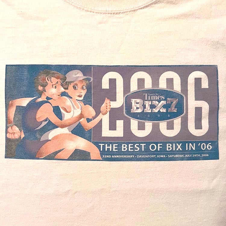
2006
Can't tell the brand, but it's heavy cotton.
Overall: B-
This is a pretty nice race shirt.The artwork has a style that remember from an artist who used to do work at the Times years back. Anyway- it's awesome. Color palate- love it.
Some nice design elements from a larger design concept on a lunch box. And hey there's Bix Beiderbecke!
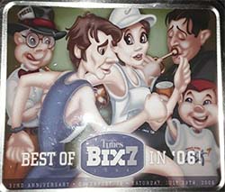 Can you guess how many times this shirt says "2006"?
2006 is printed four (4) times
I wonder if the designer noticed that 2006 was completely being beaten into the ground here. You could cut out the "2006" under the Bix7 logo for one, and also replaced "The Best of Bix in '06" with, I don't know, some tagline that the shirts have used in the past. Like- Run with the Best. But hey- "Bix in oh-six" rhymes, gotta keep the rhymes goin', folks.
A good example of a shirt designed by committee with the original vision getting completely lost along the way. Too many compromises squander a really nice illustration.
At the bottom is the date and year, again. If you read the fine print "32nd Anniversary" appears, but this isn't really an anniversary in the 'multiple of 5' sense. Perfect place to put a mini-cornet between the date and location...
Or in place of the 2006. I dunno- the art director thinks people are loving the big/tall year on the shirt now. "Gotta give 'em what they want" despite everyone saying "uh, no".
We're not done! What creative rhyme is on this shirt? "The Best of Bix in '06".
We're not done! What creative rhyme is on this shirt? "The Best of Bix in '06".
- Year count record: 2006 four times
- Tiny Bix7
- Rhyming text
- Runner Art
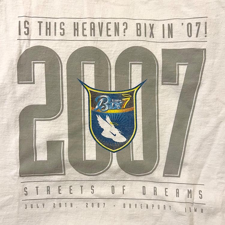
2007 (references 2001)
50/50 blend was way too heavy. Wore this as a scrub shirt for a few years and managed to pit it out. And the print wore out. Did not age well.
Overall: D
I found this 2007 shirt and I'm not sure if it's the volunteer version. br The beveled in the logo is nicely done and this is a rare occasion of 'Bix7' running the width of the design.
Unlike the race T, which if you can't tell, vastly emphasises the "2007" over the Bix7 logo.
RARE for a shirt this recent is to have just 3 elements: Bix Logo, QCT, an year. My only knock is the U of Michigan colors. If it had "Davenport, IA", there's your race tshirt.
A Nike shoe and huge year text is not needed.
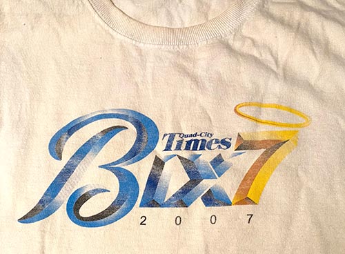
Tall year text is back, baby! Someone was out of ideas so a few things were thrown together: Big year numbers from 2001, 2003, 2004, a Nike shoe, some halos, thoughts on afterlife, and a rhyme.
There have many phrases on shirts over the years but in the aughts someone thought to make them rhymes. Cute, sure, but nothing about this is memorable. Reading it again, I had long forgotten this one, unlike, say 1992 or 1982 even. So what do we have here?
"Is this Heaven? Bix in '07"
Are we not the Best to run with? What happened here? But wait we're not even done. "Streets of Dreams" is underneath. Haven't seen that before or since.
Now, don't get me wrong, the streets referred to here are Brady, Kirkwood, and McClellan, I'm guessing. Who doesn't like or love those major arteries and throughway's of our much loved Davenport? And don't many folks at one point in their life dream on these streets- nay, inspire hope?
Now, don't get me wrong, the streets referred to here are Brady, Kirkwood, and McClellan, I'm guessing. Who doesn't like or love those major arteries and throughway's of our much loved Davenport? And don't many folks at one point in their life dream on these streets- nay, inspire hope?
The devil horns badge
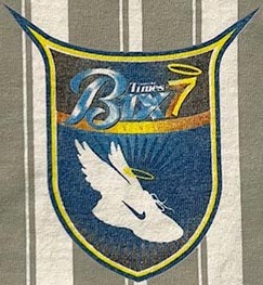 Note the halo above the '7' in the badge. Go ahead, note it! Speaking of this badge, it's different enough from the 2004 Badge and has not be used again. The Badge would be welcome over this pointy devil horns thingee.Odd.
Note that no shirt with a year ending in "7" has used that as a design element in conjunction with "Bix7".
Possibly all the best designers or would be designers tried to use a "7" from the year in conjunction with the "Bix7" design. And every single person gave it a shot came up with something that looked worse.
There exists that perfect shirt design leveraging the year ending in 7 with Bix7.
Possibly all the best designers or would be designers tried to use a "7" from the year in conjunction with the "Bix7" design. And every single person gave it a shot came up with something that looked worse.
There exists that perfect shirt design leveraging the year ending in 7 with Bix7.
With the Bix7 logo this small, that means next year will make "Bix7" much much larger. Just a hunch.
- Tiny Bix7
- Rhyming text
- Tall Year
- Running shoe
- Nike Logo on shoe
- 2007 mentions: 2 times
- Shoe sprouted wings
- Halos on shoe and '7'
- Alt-badge with devil horns
- U of Michigan colors (Blue & Gold)
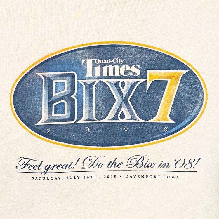
2008
Gildan Ultimate Cotton. A tad too heavy
Overall: C-
A reset. Make no mistake this is a Bix7 shirt. "Feel great! Do the Bix in '08" in a fancy script font on the bottom. See that? Fancy! Someone came in and said "No more tall year text- it's done, played out. This is evidenced by the Bix7 Logo stomping on the tiny '2008' text. The year of the run is in three (3) places.
Evidence that any other font just wouldn't work:
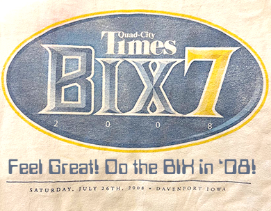
"Feel great! Do the Bix in '08"
Leave the fancy script font for a wedding announcement.Insipid text and bad font choice... two turkeys don't make an eagle.
QC Times is finally shown some love here with their name in readable text. Maybe they got involved and said "Oy! Quit butchering our brand".
The Bix7 tshirt finally uses an oval as the hero of the shirt, while not as slick as 2000. It's a throwaway design with elements that will never be used again.
- The oval
- Rhyming text
- Fancy script font
- Spikey font
- U of Michigan colors (Blue & Gold)
- 2008 mentions: 3 times
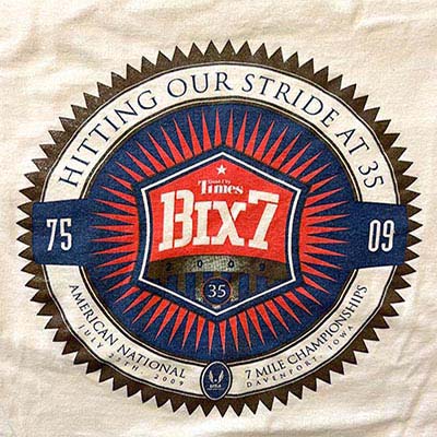
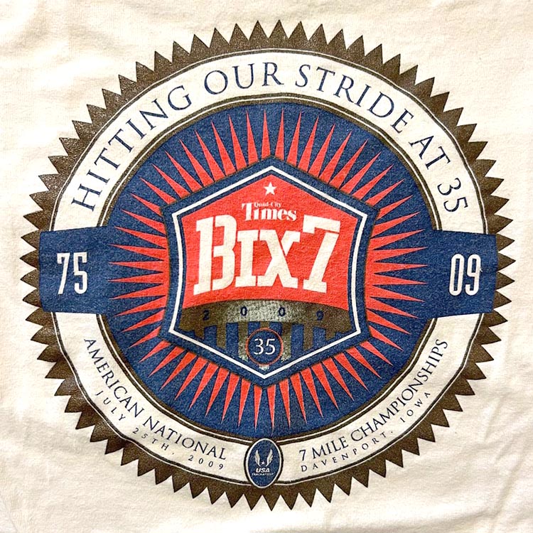
2009
Overall: B+
Easily the best shirt of the 00s. Bix7 is the star of the show, the imagery is cool, almost no gradients[Ed. note: except the one], the logo in the hexagon, all well done. Very easy on the eyes.
"Hitting our stride at 35" isn't that groan inducing, but it's still wince inducing. While I'm not a fan of these text blurbs, I feel like it just doesn't work with feel of the design- some throw-away line with such a great design.
"Hitting our stride at 35"
Did it take us that long to hit our stride? Really? Says who? I hit my stride in '92.
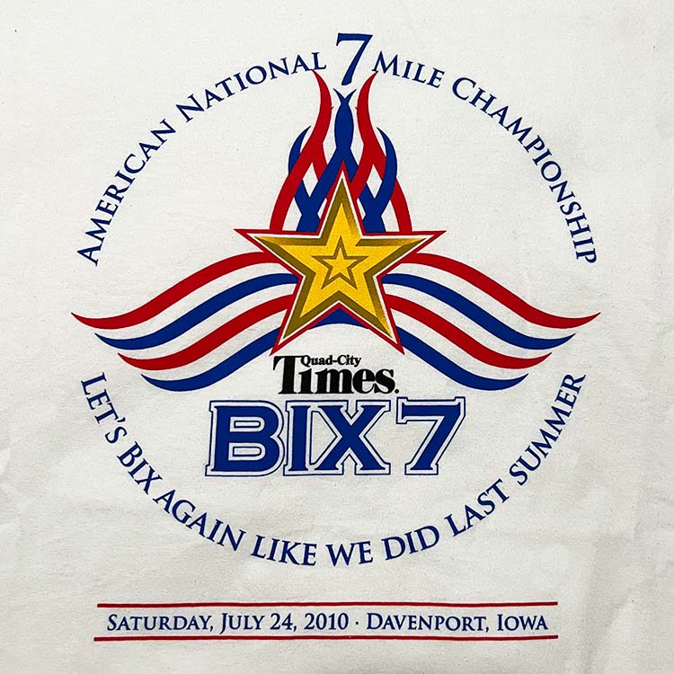
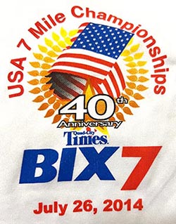
This is a pretty good Anniversary shirt, and it's a 7 Mile Championship shirt. Possibly the big guns were pulled in so this wouldn't be just another 00's Bix7 shirt with big numbers and a really small Bix7 logo.
This is a one of kind shirt, it stands out.
This is a one of kind shirt, it stands out.
Designwise the gradient
here was a bad choice.
here was a bad choice.
 This is a nitpick, and I've worked with designers who obsess over detail. So I ask why is the year on this shirt three (3) times? Bix7 gets one mention. 35 Bix is mentioned twice (but not as an anniversary! Why?). I'm sure someone noticed this and said "Hey- we don't need to put the year 3 times".
- Bix Logo MkV
- Rhyming text
- Cool images
- Anniversary Shirt
- 2009 mentions: 3 times
- Only shirt to use "stride"
2010s Bix7 TShirts: 2010-2019
Here we have designs with rhyming text, shirt pocket sized designs, so-so artwork, a few 'buncha runners', and a 1985 callback.
This is possibly the lowest point in Bix7 tshirt design for a decade. I don't want to say that most of the designs are garbage, but they really are. Compare to the other decades and they just fail on every count.
This is possibly the lowest point in Bix7 tshirt design for a decade. I don't want to say that most of the designs are garbage, but they really are. Compare to the other decades and they just fail on every count.

2010
Overall: D
Umm... what?
"Let's Bix again like we did last summer"
Whoever did this just needs to stop.
Whoever did this just needs to stop.
2010 is a big year. If we compare this with shirts past- it's bad. The 2000 shirt is slick. 1990 is a classic. 1980 is also one of the best. So what do we have here? Riffing on some lyrics by a seminal song by Chubby Checker.
Was there a mandate that every 5 years starting in 2005 there was a need to riff on a song's lyrics to include a Bix reference?
Was there a mandate that every 5 years starting in 2005 there was a need to riff on a song's lyrics to include a Bix reference?
Nothing about this one really strikes me.
Tough to follow up the 2009 shirt.
Looks like a New England Patriots fan designed it.
Tough to follow up the 2009 shirt.
Looks like a New England Patriots fan designed it.
- Big Star
- Circle motif
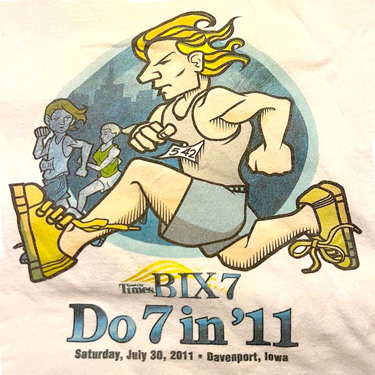
2011
50/50 blend. Heavy. Weat it in the winter because this thing ie HEAVY.
Overall: C
This style doesn't appear that often, and when I turned to corner after sign in in 2011 and saw that this was the shirt design? Ehhh. We're gonna be in the tshirt weeds for another decade.
"Do 7 in '11"
Marketing is like "hey I know a really cool artist who can draw *runners*, ya just gotta see this blond guy running with a mean look- Forget any Bix7 shirt you've seen before- the shirts in the 80s with the rainbows, the colorful ones in the 90s, nevermind the classic 70s shirts... HERE we have.... this. It's the future".
I hope the writer of the text on this one didn't hurt their arm patting themselves on the back for coming up with something this witty line. Like... Hmmm... Perform seven miles of running in the year two thousand and eleven. I can shorten that a bit, I think. Really other level stuff here.
But the small Bix logo? Logo is in serif script which is rare and the last time used in 1994. I try to find the positives but to me- this Bix7 logo sucks. There's really nothing other than a circle and the QCTimes logo that links this shirt thematically to any shirt and WOW! This runner looks pissed.
- Runner illustration
- Sans-serif Bix7 Logo
- Rhyming text
- Tiny QCT Logo
- Circle motif
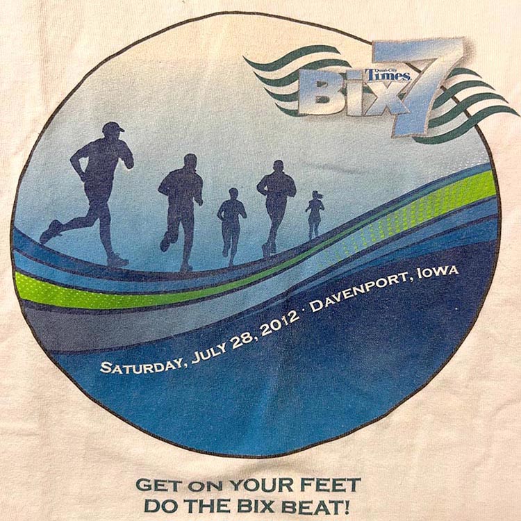
2012
Gildan Ultra cotton way too heavy.
Overall: D
"I need some silhouetted runners running into the distance on some wavy lines, there has to be mist "
... the artist does their best.
... the artist does their best.
It's a design. Runners heading into the blue mist. The vibe comes across as a little eerie and puts me in a somber mood. The lines make it feel like a marble of some sort. The all-caps text is just so demanding! "What are you doing? GET ON YOUR FEET!".
"Get on Your Feet / Do the Bix Beat"
Bix7 logo doesn't pop. Text fill is a light blue & white gradient next to a... light blue & white gradient. The "7" looks like it's eating "Bix". The space below and to the left of Bix7 is kind of empty. Stark. Negative space at the bottom of the circle.
Who approved this mess?
Where are these runners running to in this blue dream? Into the blue mist? Into the dark ages of Bix7 tshirts? I'm sad...
The only thematic elements that tie this with its brethren are the circle motif and the waves flanking the Bix7 logo (remember the rainbow? I'm trying find something positive here).
Now this looks worse
 There are 5 runners. This is Bix7. The year ends in 12. WHAT DOES IT ALL MEAN?
Also- "Get on Your Feet": great Gloria Estefan song from 1989.
- Buncha runners
- Circle motif
- Small Bix Logo
- Rhyming text
- Tiny QCT Logo
- Somber mood
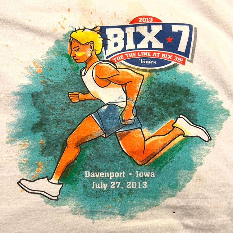
2013
Gildan Ultra cotton. Pretty heavy.
Overall: C
Orange running manThe runner illustration doesn't appear that often, but again so soon after 2011? The artwork isn't bad, just not my cup of tea. At least the Bix7 logo pops. Year is mentioned twice, which is still half as much as the 2006 shirt. Rather tired of that pattern, and fortunately it no longer is an issue in subsequent designs.
"Wait, pay $40+ to run some hills and I get *THIS* shirt?".
"Wait, pay $40+ to run some hills and I get *THIS* shirt?".
"Toe the Line at Bix 39"
Great line- well thought out. I shall toe that line, good person. Actually no- stop it! Stop it with the stupid rhymes. Art director or copywriter in charge here is getting it completely wrong. This is one of the worst catchphrases on a Bix T. To borrow a phrase from a colleague I had at the time- "I can't".What's up with this masking? Always wondered if this was a mistake or the art being art
"Yeah I spoke with Stevens in marketing about the QCT placement on the Bix shirt and they said 'whatevs, just make sure it's above the Bix7 logo', so it's cool. Let's go get a taco from Rudy's".
This is supposed to be the "QUAD-CITY TIMES BIX 7", Punky Brewster! Show some respect.
This illustration is fine. Colors are fine, type is nice. "Davenport • Iowa" instead of "Davenport, IA"- you can draw your own conclusions here. [Ed. note: There are none to be, as you say, 'drawn'... OH I get it. "]
That teal watercolor inkblot is BLOWING MY MIND!
- Circle motif
- Bix Logo MkV
- Runner illustration
- Rhyming text
- Tiny QCT Logo
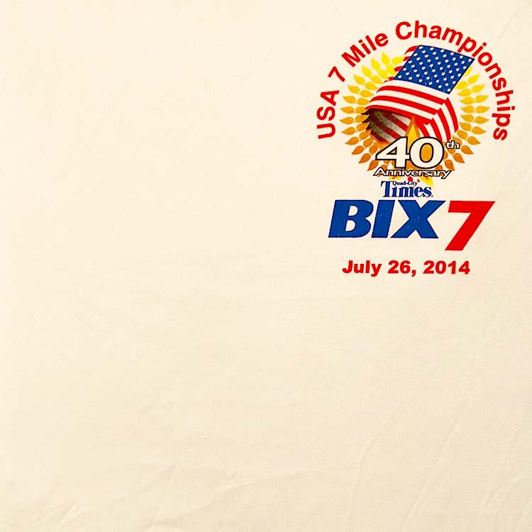
2014
This is a Gildan Performance shirt, which is light and sporty.
Overall: C-
Someone noticed there hasn't been a shirt pocket size shirt 1995 so THAT problem has been solved.
This shirt has a purpose- "7 mile Championships!". Looks like the designer knew what they were doing. 2nd appearance of a laurel wreath on a bix shirt. The Bix7 wordmark stands out, while different from all the others, it's quite nice. Minuscule Quad-City Times. Someone will get fired.
"What do you mean 'Davenport' can't fit on the shirt?"
It's okay, the design is very crisp, but not memorable in the canon of Bix tshirt designs. It feels like whoever designed this had no idea what the Bix7 is. This was a missed opportunity. No one says "But that Bix 2014 is the one to have".
- L'il Quad-Cities Times
- Shirt pocket size
- Laurel wreath
- Tiny QCT Logo
- Anniversary Shirt
- Circle motif
- Davenport
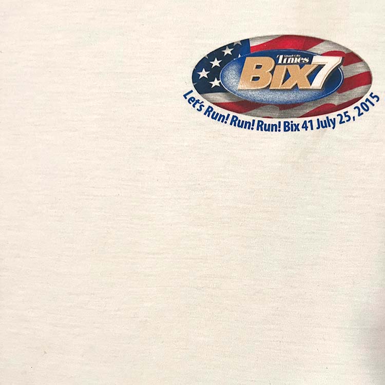
2015
This is a Gildan Performance shirt, which is light and sporty. Printing looks on the cheaper side, so the excessive gradients used will fade away over time
Overall: D-
The backlash to this shirt has been seen in the following years:
Changes:
Changes:
- No more Shirt pocket size designs
- Rhyming text ended
- 'Quad-City Times' no longer this tiny
- Bad gradients avoided
- Davenport always included
What the heck? Who? Why?
Shirt pocket size design two years in a row? No.40 years of Bix7 tshirt design history to draw on and this is it? Sure, 1983 and 1984 were shirt pocket size with the same design, but that doesn't make it a good idea!
"What do you mean 'Davenport' STILL can't fit on the shirt?"
One could throw this together in an hour or two. Again, 'Quad-City Times' is barely readable. Did anybody get heat for this? "Does anyone give a s#!t about QCT branding?", asked Walter Sobchak.
"You can barely read 'Quad-City Times' and this is gonna be worn by 15 thousand people?
"You can barely read 'Quad-City Times' and this is gonna be worn by 15 thousand people?
You have an entire shirt size... why...".
That this has happened multiple times- the shirt pocket size design- it's terrible. A complete waste. For years I'd held up hope that "this year it'll be awesome". But this was the year I gave up hope that there was any care given to the design.
That this has happened multiple times- the shirt pocket size design- it's terrible. A complete waste. For years I'd held up hope that "this year it'll be awesome". But this was the year I gave up hope that there was any care given to the design.
If it was my job to ensure that 'Quad-City Times' placement was done in the best possible way, I could not approve this. Was the goal to make the QCT logo as small as possible and not creatively integrate it with the design like previous designs?
I've worked with companies where representing the logo and brand had to satisfy criteria as to THIS IS THE HOW THE BRAND IS PRESENTED.
Ummm...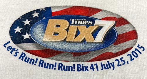
Let's Run! Run! Run! Bix 41
Here's where things go a sideways- the text. I just noticed this one because I clearly didn't read it when I got it in 2015. There's the text "Let's Run! Run! Run!".
Well sure- it's a race. It's the Bix7. We're running, gotcha.
Who was in the writers room for this?
Well sure- it's a race. It's the Bix7. We're running, gotcha.
Who was in the writers room for this?
"Davenport, IA" ended up with the short end of the stick.
- Shirt pocket size
- L'il Quad-Cities Times
- Rhyming text
- Davenport
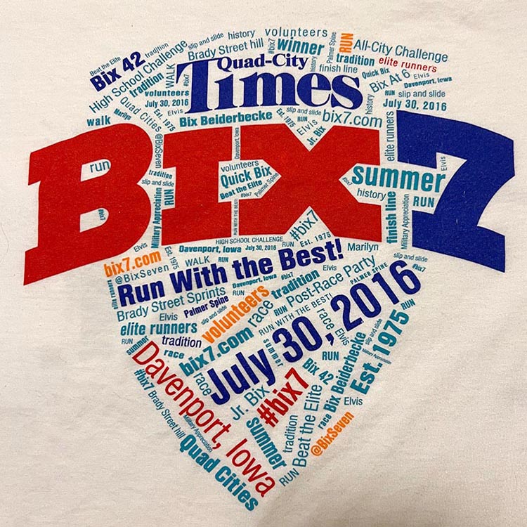
2016
Overall: B
A list of the frequency of the words used. Counts are listed before the keyword on the word cloud.
(14) run (10) #bix7
(8) Elvis
(7) tradition
(6) slip and slide
(5) race
(5) Davenport, Iowa
(5) elite runners
(5) Est. 1975
(4) summer
(4) Palmer Spine
(4) Military Appreciation
(4) history
(3) volunteers
(3) bix7.com
(3) @BixSeven
(3) walk
(2) Bix 42
(2) High School Challenge
(2) Marilyn
(2) July 30, 2016
(2) Jr. Bix
(2) Beat the Elite
(2) Run with the Best!
(2) Quad Cities
(2) quick bix
(2) Bix Beiderbecke
(2) Brady Street Hill
(2) finish line
1 mention each: winner, Bix at 6, All-CIty Challenge, Brady Street Sprints, Post-Race Party
This is a reset. Bix7 is front and center. Make no mistake- this is Bix7!
It's not bad. Colors pop, solid printing without gradients. 'Quad-City Times' word mark gets some love. And this is the first text-only design.
"'Davenport' is listed 5 times, boom!"
"Elvis" is mentioned 8 times for the 3rd most mentions. "Bix Beiderbecke" only twice. I get why the 2005 shirt happened now- efforts to make Elvis the real draw here. Knowing what I know about Bix Beiderbecke and the impact he had as a musician and that he is from Davenport. If I was asked, I'd say mention Bix more than Elvis (from Tupelo, not Davenport).
The Cornbelt Running Club, who started the race in 1975, doesn't get a mention. Ouch. Their site doesn't list the Bix7 race as of this writing, but the bix7 site lists the CBRC as an affiliate. Maybe show a little love? IDK? Politics, maybe.
There's a slip and slide, but it's really not that big of a deal. "Palmer spine"- yep, couldn't be a Bix7 race without that.
My suggestions that no one asked for:
"Starting line" [Ed. note: Obviously]"Middle Rd"
"McClellan Blvd" [Ed. note: Obviously]
"Kirkwood Blvd", "Kirkwood median" [Ed. note: need space for "Palmer Spine", and "High School Challenge", sorry"]
"Cornbelt Running Club" [Ed. note: Politics, so no"]
"Joan Benoit-Samuelson", "Bill Rodgers", "Frank Shorter", or any Bix7 winner[Ed. note: file under "beat the elite"]
"Water Stations"
"Cornet" [Ed. note: never happen]
What's the tshirt design budge- $20k? How many area design firms make a bid to design the Bix7 race shirt? Curious how many creative pitches get heard.
Leave mentions of Bix Beiderbecke and jazz to the 'Bix Lives' Jazz Festival. Gotta stay in our Bix7 lanes, folks.
- Word Cloud!
- Text only design
- First usage of "Bix Beiderbecke" text
- First usage of "Est: 1975" text
- The Badge!
- Bix Logo MkV
- "Run with the Best!"
2017
Overall: C-
This is a Gildan Performance shirt, which is light and sporty. Printing is slightly better.
 Notice the blue silhouetted runners cascading down the left side. The bottom person has their arms raised in victory! Odd thing about the runners- the dark blue shapes have a radial blur coming from almost the center, which is over the hip area. An art director should have spotted and said something like "Oi! Move the glow up- their hips are glowing."
No more gradients.
There's the Bix Logo element- This is a Bix shirt! The skyline could be Davenport. The BADGE returns from 2004 and 2016. Will they declare this as THE Bix7 branding element?
This one doesn't look good in any collection.
This one doesn't look good in any collection.
"Runners are falling out of the sky!"
While my opinion (which does not matter- ask anyone) is that this was "eh...". I grew up on Bix7 tshirts I loved. After the 90s there had been little to really stand out. The last time I was wowed was in 2009- why can't they all just CRUSH it?
Were the shirts I grew up with in hindsight ever bad? You can ding '83, '89, '95, '98, sure. I say "aim to be as good as the great ones, and, maybe, better".
Were the shirts I grew up with in hindsight ever bad? You can ding '83, '89, '95, '98, sure. I say "aim to be as good as the great ones, and, maybe, better".
Bix-y, yes. There's no "Run with the Best" this time, however, and thankfully no rhyming text either. The runner at the bottom raises their hands celebrating the end of the rhymes.
This race has special love as I walked it with my sister and my oldest friend Pat (his first Bix).
THIS SHIRT:
BUT ALL OF A SUDDEN
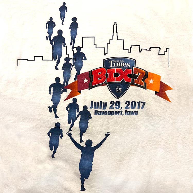
So this is inspired of the 1981 Bix7 shirt and adds the American National 7 Mile Championships text. Love it. Seeing this for sale after I registered for the 2017 Bix, I was thankful.Who made this happen? Someone cares about Bix7 tshirts again. Thank you.
It looks like a toy trumpet there, but that's okay.
- Bix Logo MkV
- The Badge!
- "Est: 1975" now in the Badge
- Buncha Runners
- Tiny QCT Logo
- Radial gradient on the runners
2018
Overall: C+
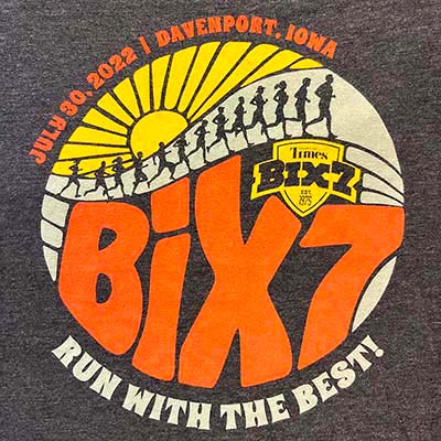
The 'buncha runners' design first appeared in 1982 and has been used five (5) times (ranked): 1982, 2022, 2018, 2012, and 2017.
The volunteer version:
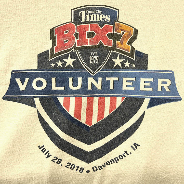
I remember seeing this shirt for the first time, when I rounded the back of the exhibition hall at the Bix registration. Woah it's a non-white shirt! First since 1984, bravo! Awesome. What could go wrong here?
The design has an insanely high width to height ratio. You could move around the badge to made it larger and nix some of the runners on the right. The Bix7 Badge logo is too small, the "Run with the best" text lacks contrast, there's no dominant element. They should find a designer to point the easy flaws out.
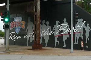
The design looks cool as a mural here in Dav
The problem is that the "buncha runners" design element appears 2 years in a row, and does nothing original other that have them horizontal rather than vertical.
The design fixes some issues with the similar 2017 shirt, which is nice, but this is shuffling deck chairs more or less.
If the thinking was "Well the 2017 design was so awesome we'll just re-do that, but on a dark tshirt", then we are losing some serious opportunities here. You need to make these designs count, and this one is not a step in the right direction.
- Bix Logo MkV
- "Run With the Best"
- Tiny QCT Logo
- The Badge!
- Buncha Runners
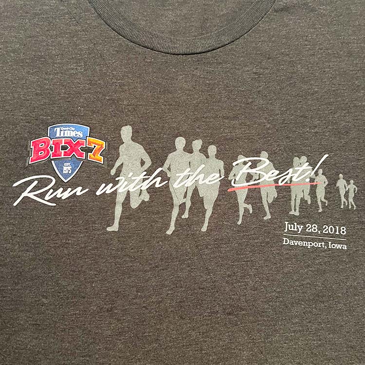
2019 (references 1985, 1986, 1987)
Overall: B+
2019 vs 1987: We all win!
This is a nice callback to the 1985-1987 tshirt design.
Red, Orange, Yellow, Green, Blue. 1985. This MarkII Bix7 Logo hasn't appeared on a shirt in 20 years!
Love the dark tshirt color. It's not a solid color shirt, but marbled. Definitely needed this one. And making this the most appearances of a given design at four (4): 1985, 1986, 1987, 2019. I about cried (real tears of real joy) after snagging my race packet. No shirt pocket design. No tiny Bix7. No tall year. No dumb rhyme or slogon. This is straight up love and respect of the Bix7 tshirt, for the most part.
The type used and the text placement could be better.
A side by side comparison. The 2017 shirt's text doesn't hug the contours of the design.

The bottom text is level instead of hugging the curve of the stripes like the older design. In that way it feels disassociated with it.
If there was one time to put a little cornet on the shirt, as basically a bullet spacer between the location and the date, why was that not done?[Ed. note: Above your pay grade]
The years of the Bix7 shirts just being forgettable are over. This one made me smile.
- Bix7 MkII Logo
- "Run With the Best"
- Rainbow
- Dark shirt
20s Bix7 TShirts: 2020-present
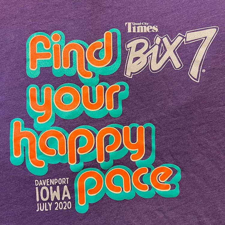

2020
Overall: A
Everything about this shirt is awesome.
This hasn't happened in awhile where a shirt comes out that is not like anything we have seen before. And it's really good. It's got its own style with nice custom Bix7 treatment that is worked into the overall design. The colors work. LOVE a dark colored shirt.
Some thought and real care went into the type work- like real actual effort.
Some thought and real care went into the type work- like real actual effort.
THIS poster. I want it on my wall:
This is well done. I feel the Bix7 tshirt designs have turned a corner.
- Bix Logo MkII
- Gorgeous Fonts
- Purple shirt
- Text only design
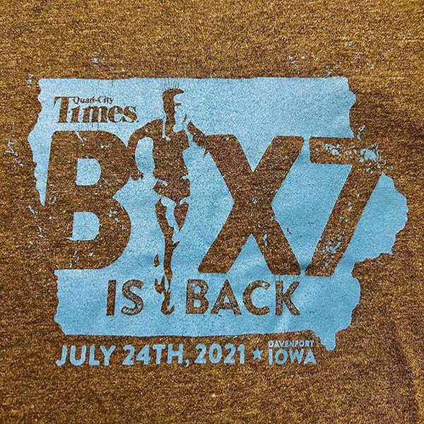
2021
Overall: C
Make: tultex 241 Heather Charcoal
The volunteer version:
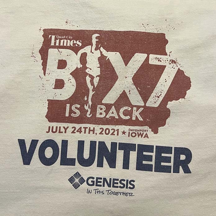
BIX7 is back! This was a year after the virtual Bix. I rather feel like the Bix never left- you could make a case for every Bix run by saying it's back, in case there was any confusion The design is OK- pared down with with some branding elements. It looks a little slapdash and just kind of thrown together when they realized they needed a shirt design. And someone said "Hey the contours of Iowa should be the shirt!". Eye rolls ensued, and here we are.
Some Bix7 tshirt firsts here:
• The state of Iowa IS the hero
• Running Man as the "I" in Bix7
• Paint splatter effect (used nicely in the elbow of the "7")
• The state of Iowa IS the hero
• Running Man as the "I" in Bix7
• Paint splatter effect (used nicely in the elbow of the "7")
The use of Iowa indicates that this is a race of Iowa. So not just Davenport, the QC, or even the Midwest: IOWA.
Who thought this was a good idea? So many creative possibilities and this is what they came up with? "Bix is Back" and this rather un-inspired design?
Possibly the state of Iowa waited many years for its shot at an appearance on a Bix7 T, and it does not fail to impress. 2021 came, and the Bix7 tshirt manager said "The physical state of Iowa IS the shirt. Iowa. Iowa IS the bix shirt. People will get it". The maps of QC and Davenport await their turns.
Iowa wasn't even on the 2017 shirt's word cloud while Davenport was. Just doesn't feel right.
The QC map, with its 'loop' might work better. Or the course map. A topographical map showing the legit challenge of the course's inclines. However, I can see giving Iowa props in general, having lived away for 25 years before moving back home. So yeah- why not give one design to the state of Iowa.
It's a far cry from where, as a First Grader at Davenport's Eisenhower Elementary we made pigs out of construction paper using the shape's form as the body of the pig. True story.
Thanks Eisenhower- took me years to try to disassociate the body of a pig with the state of Iowa.
Instead of a bullet (•) breaking up the text, there is a star. It's neat- not something we've seen before Years past you'd see the cornet:  breaking it up. Put a star on the map to point out Davenport, since it's possible no one knows where Davenport is. It may not even be in Iowa!
breaking it up. Put a star on the map to point out Davenport, since it's possible no one knows where Davenport is. It may not even be in Iowa!I can see making the bottom text white to make it pop. This is the first shirt using a single ink color since 1982. Maybe a stylistic choice.
To the point. It's okay. But another missed opportunity.
- State of Iowa
- Logo is a part of the shirt text
- Bix Logo MkI
- Running Man
- Star
- Dark shirt
2022
Overall: A
Make: tultex 241 Heather Charcoal
This volunteer shirt is on a whole other level.

Everything about this shirt is awesome.
This hasn't happened in awhile where the shirt is excels in every possible way unlike anything we have seen before. It's got its own style with nice custom Bix7 treatment that is worked into the overall design. The colors work. LOVE a dark colored shirt. The fonts above and below our familiar circle have a nice retro feel- some real thought was put into this.
A tale of 2 Bix:
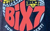

We've also never seen the appearance of two distinct Bix7 logo treatments. It almost feels superfluous, like "is this needed twice?".
The font usage is well done- thought was put into this that the retro style isn't an off-the-shelf font and really integrated into the overall design. The BIX7 is the real hero here and the effort is not wasted.
Fun to see the buncha runners motif- a nod to the 1982 shirt. Well done.
This poster: Brady! Kirkwood! McClellan! Middle! Jersey Ridge! LOVE seeing the street names. They are the Bix7.
What Bix runner doesn't drive along McClellan or up Brady at some point and think "You @#!* hill! Wait 'til next year!"
- Bix Logo MkV
- Run with the Best!
- Buncha Runners
- Dark shirt
- The Badge!
- The Sun
2023
Overall: B-
Make: tultex 241 Heather Navy
The 40 year drought of no blue bix tshirts is over!
Worthy of note is the last few years the brand of the tshirt has been tultex®. IMHO these are great breezy & comfy shirts (not like the bulky Hanes Beefy-T).
Worthy of note is the last few years the brand of the tshirt has been tultex®. IMHO these are great breezy & comfy shirts (not like the bulky Hanes Beefy-T).
This shirt design does a job. This is a American National 7-Mile Championship. There is a flag. Font treatment is very solid. As a runner here, I am not keeping up with how these Championships play out. I'd rather see a really amazing design than this. I always feel like there's more potential for something awesome than paying service to showcasing that this is the American National 7-Mile Championship.
There's not too much whimsical or innovative, EXCEPT FOR THE CORNET ICON!!!
I've whinged on and on and on about the lack of one of the original Bix7 tshirt design elements that disappeared 30 years ago: Bix Beiderbecke's instrument of choice: the cornet.
The Bix7 is named after a Davenport guy: Bix Beiderbecke. And it's like one of the coolest names.
I've whinged on and on and on about the lack of one of the original Bix7 tshirt design elements that disappeared 30 years ago: Bix Beiderbecke's instrument of choice: the cornet.
The Bix7 is named after a Davenport guy: Bix Beiderbecke. And it's like one of the coolest names.
The last appearance of the cornet was in 1993, and that cornet was the hero of the tshirt. The next year- the cornet was gone. Until now.
Paying an homage to those amazing origins is a good thing. A wink to those that know that yeah- the cornet on the shirts in the first 20 years. A runner inspired by the jazz festival and the Boston marathon in 1975 made an "out and back course" with less than a hundred runners in Davenport that exists to this day.
- Bix Logo MkV
- Blue tshirt
- The Badge!
- American National 7-Mile Championships
- Cornet
What's next?
I have no idea. I want to be surprised with a design that, like the folks who have made these shirts going back to the 70s would have no idea that years later people would still care about and love these shirts.
This year I will go to the Bix Expo, get my Bix bag and poster, get four (4) safety pins, find my name on the wall, go to the table and ask for my bib, walk around to the other side and hope to see a Bix TShirt that really makes me smile.
This year I will go to the Bix Expo, get my Bix bag and poster, get four (4) safety pins, find my name on the wall, go to the table and ask for my bib, walk around to the other side and hope to see a Bix TShirt that really makes me smile.
A Fun Table of Bix tshirt Stuff
| Cornet: 38% | CBRC: 21% | White T: 75% | Davenport: 77% | QC Times: 88% | Run w Best: 25% | Rainbow: 19% | Running Man: 15% | Runners: 10% | Circle Motif: 35% | Badge Motif: 13% | ShirtPocket: 10% | Tall Year: 10% | Rhyming: 21% | |
|---|---|---|---|---|---|---|---|---|---|---|---|---|---|---|
| 1976 | ||||||||||||||
| 1977 | ||||||||||||||
| 1978 | ||||||||||||||
| 1979 | ||||||||||||||
| 1980 | ||||||||||||||
| 1981 | ||||||||||||||
| 1982 | ||||||||||||||
| 1983 | ||||||||||||||
| 1984 | ||||||||||||||
| 1985 | ||||||||||||||
| 1986 | ||||||||||||||
| 1987 | ||||||||||||||
| 1988 | ||||||||||||||
| 1989 | ||||||||||||||
| 1990 | ||||||||||||||
| 1991 | ||||||||||||||
| 1992 | ||||||||||||||
| 1993 | ||||||||||||||
| 1994 | ||||||||||||||
| 1995 | ||||||||||||||
| 1996 | ||||||||||||||
| 1997 | ||||||||||||||
| 1998 | ||||||||||||||
| 1999 | ||||||||||||||
| 2000 | ||||||||||||||
| 2001 | ||||||||||||||
| 2002 | ||||||||||||||
| 2003 | ||||||||||||||
| 2004 | ||||||||||||||
| 2005 | ||||||||||||||
| 2006 | ||||||||||||||
| 2007 | ||||||||||||||
| 2008 | ||||||||||||||
| 2009 | ||||||||||||||
| 2010 | ||||||||||||||
| 2011 | ||||||||||||||
| 2012 | ||||||||||||||
| 2013 | ||||||||||||||
| 2014 | ||||||||||||||
| 2015 | ||||||||||||||
| 2016 | ||||||||||||||
| 2017 | ||||||||||||||
| 2018 | ||||||||||||||
| 2019 | ||||||||||||||
| 2020 | ||||||||||||||
| 2021 | ||||||||||||||
| 2022 | ||||||||||||||
| 2023 | ||||||||||||||
| Cornet: 38% | CBRC: 21% | White T: 75% | Davenport: 77% | QC Times: 88% | Run w Best: 25% | Rainbow: 19% | Running Man: 15% | Runners: 10% | Circle Motif: 35% | Badge Motif: 13% | ShirtPocket: 10% | Tall Year: 10% | Rhyming: 21% |


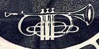

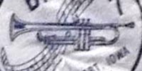


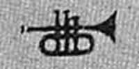
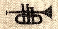
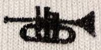
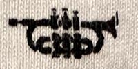


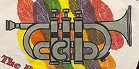
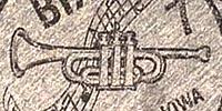
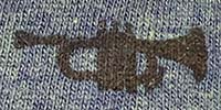
Shirts by Type
All Shirts
Bix7 Wordmarks
By Decade and Year
Ranked By Vote
"Circle Motif"
"Buncha Runners"
"Shirt Pocket"
"Tall Year"
"Championship"
"Catch Phrases"
© 2022-present John S. Barker, Bettendorf, IA7